
Create a Time Comparison
Create a visual that compares two time periods or more.
Access requirements
Permission with these capabilities: Ad Hoc Analysis
Reach out to your administrator for access.
Note: This type of comparison is available for the Breakdown, Trend, and Trend Breakdown visual.
Comparing time periods is a helpful strategy in evaluating your organization's current performance against previous periods and identifying emerging trends.
The following screenshot shows the Breakdown of Resignation Rate for Mar 2019 vs. Feb 2019 by Location in Columns view.
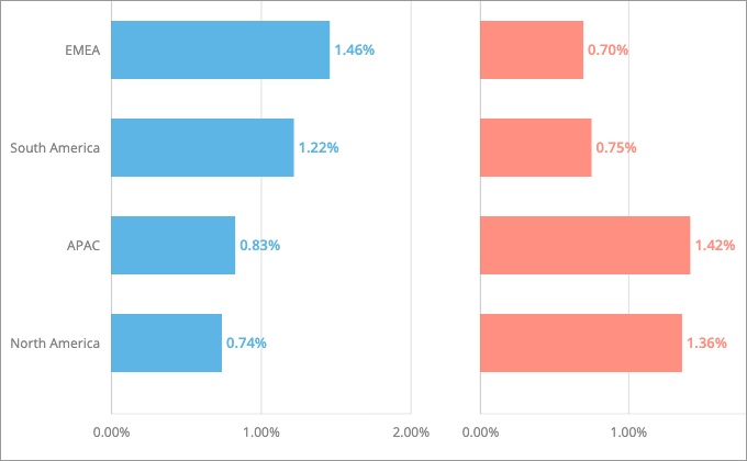
Compare time periods in the Breakdown visual
-
Click the Compare to button
 on the Visual Actions menu to create a comparison.
 - In the Compare to panel, click Time period.
- In the Time picker, add a comparator for your selected time period.
-
To rename comparators, select the comparator in the Compare to panel, enter a display name, and click Done.
Note:
- The custom display name is used in the visual title, captures, and chart cards in an analysis.
- Changing the display name of comparators in a capture or chart card will not affect other existing captures or cards.
- To add additional comparators, click Add time period.
Note: You can compare a maximum of 4 time periods.
-
To change the comparison view, select an option under Adjust View in the Compare to panel.
Note:
-
Difference and Side By Side + Difference views are only available when you have two comparators.
-
You can show differences as a count or percent. Toggle on the secondary label to show both values in the Compare to panel.
-
Compare years in the Trend and Trend Breakdown visual
-
Click the Compare to button
on the Visual Actions menu to create a comparison. - In the Compare to panel, click Year.
- Select the years you want to compare in the Compare years panel.
Note: You can compare a maximum of 4 years.
- When finished, click Save.
-
To change the comparison view, select an option under Adjust View in the Compare to panel.
Note:
-
Difference and Side By Side + Difference views are only available when you have two comparators.
-
You can show differences as a count or percent. Toggle on the secondary label to show both values in the Compare to panel.
-
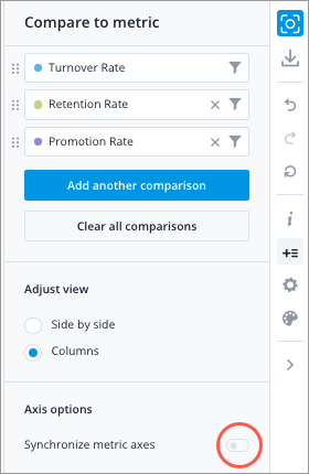
Synchronize metric axes
Some comparison views will show multiple charts in a single visualization. For example, you'll see multiple bar charts side by side when using the Columns view in a Breakdown visual.
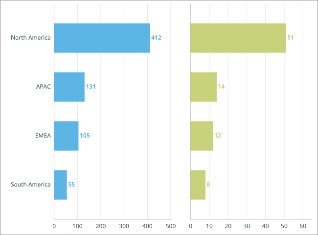
By default, the minimum and maximum scale values for each chart are automatically calculated based on its data. However, charts that have different scales can be misleading especially when they're placed side by side. For example in the preceding visualization, it appears as though the horizontal bars for North America are almost the same across the two charts. However, when you look at the actual values, you'll notice they are very different (412 and 51). To make the datasets easier to compare and help users understand the differences in magnitude, you may want to apply the same scale across all the charts.
If you want the charts in the visualization to use the same scale, turn on the Synchronize metric axes toggle in the Compare to panel under Axis options.
Depending on the selected view the horizontal or vertical axes will be synced:
| View | Synced Axes |
|---|---|
| Side by side & difference | Horizontal |
| Columns | Horizontal |
| Rows | Vertical |
The axis with the largest range (difference between the maximum and minimum scale values) will be used to scale the charts in the visual. In this example, the ranges for the horizontal axes are: 500 (500 - 0) and 60 (60 - 0). The chart on the left has the largest range so we scale the other chart using this range.
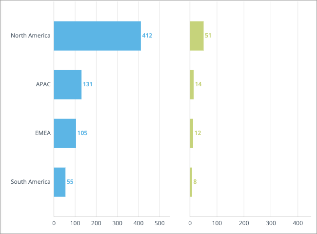
Note: Chart intervals (tick marks) are automatically added when additional space is required to show data labels. As a result, charts that have synchronized metric axes may not display the same maximum scale value. In this example, the chart on the left has a maximum scale value of 500 to accommodate the data label for North America (412). This additional space is not needed for the chart on the right so it has a maximum scale of 400.
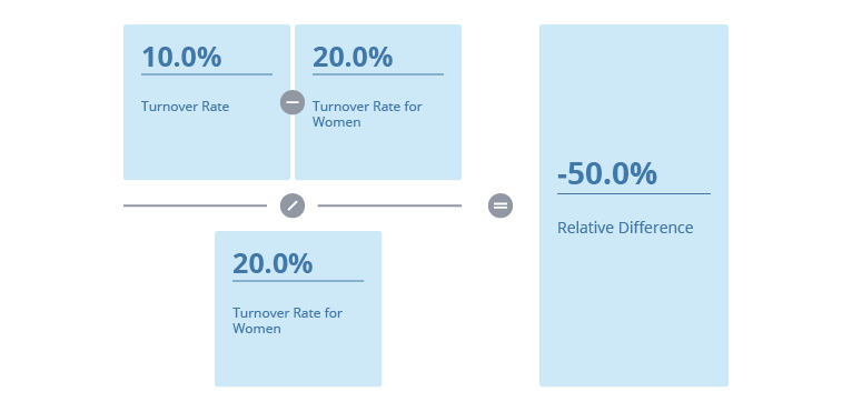
How the difference between two metric values is calculated
When comparing metric values using percentages, the relative difference is calculated by subtracting the primary (reference) metric from the secondary (comparison) metric, and then dividing the difference by the secondary metric.
For example, you want to compare the overall Turnover Rate to the Turnover Rate for women, where:
- The overall Turnover Rate is 10.0% (primary metric)
- The Turnover Rate for Women is 30.0% (secondary metric)
The relative difference or percentage change is calculated as follows:
This formula is also used when evaluating the conditional rules for analysis email delivery and traffic lighting.