
Contribution Visual
Compare the contribution of different members to a metric value.
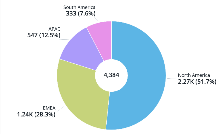
The Contribution visual is a pie chart that shows how a group contributes to a whole. The visual is a circle that is divided into slices, where each slice represents a different group that makes up the whole. The size of each slice is proportional to its share in the overall metric value. The bigger the slice, the higher the percentage of the whole it represents. Use this visual to highlight the specific groups that contribute to a whole.
The Contribution visual should be used sparingly because it relies on areas and angles to represent data. Most people are bad at judging quantities and making comparisons using angles, which leads to misinterpretation. The visual can quickly become too complex and hard to understand when there are too many slices. It can be challenging to distinguish the differences between slices when the metric values are similar.
Remember, this visual shows data as a percentage of a whole, so the slices must always add up to 100 percent. If the slices do not add up, you risk misleading your viewers.
Note: The slices may not add up to 100% when specific data items have been hidden from the visual (add focus) or a specific level of the group by attribute has been selected. In these cases, an unlabeled, gray slice will appear in the visual to represent the data that is not included in the selection.
How to explore the visual to gain insight
- View data for a specific group of employees or analysis population by adding filters.
- View more details about a group in the Info panel by clicking the group.
- Drill down and explore other levels of the group by double-clicking the group.
- Increase the readability of the visual by adjusting chart settings:
- Change the label options to show the percentage share of each group to the whole
- Show the overall metric value in the center of the visual
- Decrease the number of data items