
Change Data Labels
Data labels describe individual data items in a visual.
Data labels increase the clarity and readability of visuals as they allow readers to quickly associate specific values with data points. Label options include:
- Hide labels
- Show metric values
- Show percentages
- Show metric values and percentages
Note:
- Labels will be dropped if there is not enough space for them to be displayed properly in the visual.
- Available label options will differ based on the visual type and attributes selected.
Change primary and secondary data labels
You can change data labels for the primary attribute for the following visual types:
- Breakdown
- Trend Breakdown
- Contribution
You can change the data labels for the secondary attribute for the following visual types:
- Breakdown
- Trend Breakdown
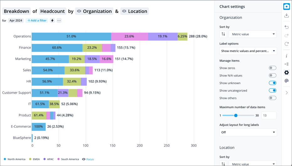
The following Breakdown visual contains two attributes: Organization (primary) and Location (secondary). The data labels are set to display the metric and percentage values for each organization and the percentage value for each location.
-
Click the Settings button
 on the Visual Actions menu.
 - In the Chart settings panel, find the attribute you want to change the data label for.
- Under Label options, select the information you want to display as a data label.
Note: You can only change data labels when looking at a single, additive metric.
- Comparisons are not supported.
- Additive metrics are metrics where you can sum the values of the different populations to calculate a total value for the combined population.
- Headcount is an additive metric because you can add the headcounts of Group A and Group B to calculate a total.
- Resignation Rate is not an additive metric because you cannot add the resignation rates of Group A and Group B to calculate a total.
Show a secondary data label in a comparison
You can turn on a secondary data label to show the difference as a count and percentage for the following visual types.
- Breakdown
- Trend
- Trend Breakdown
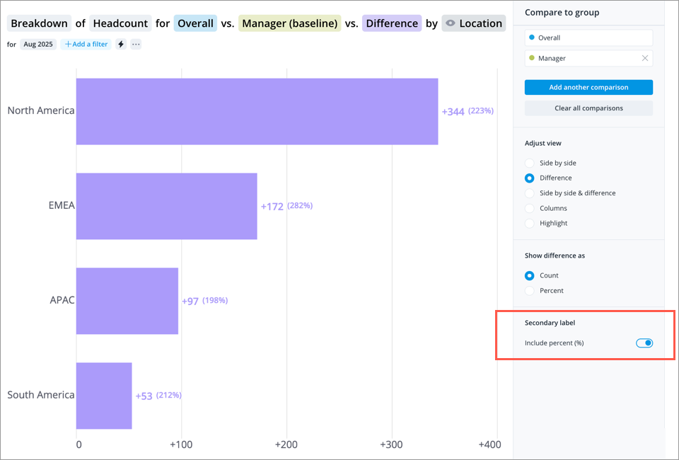
This Breakdown visual compares Headcount and Manager Headcount for each location. Differences are shown as counts, with a secondary label displaying percentages for each location.
- Create a visualization that compares two metrics, groups, scenarios, time periods, or legend items. Click the Compare to button
 on the Visual Actions menu to create a comparison. For more information, see How to Create Comparisons.
 - To show the calculated difference in the visual, select a difference view from the Compare to panel.
- Under Show difference as, set the primary label to either Count or Percent.
- Enable the Secondary label toggle in the Compare to panel.
- If the primary label is a count, the secondary label will display a percent.
- If the primary label is a percent, the secondary label will display a count.