
White Label Reports
Change the appearance of the Reports room, including typography, color, and border radius.
Overview
You can customize the Reports room to align with your application's branding, creating a seamless user experience.
Note: This capability is currently limited to the Reports room only.
White labeling options
Visier's white-labeling options offer granular control over customization, categorized by design elements and levels of application.
Design element categories
These define the specific types of visual elements you can customize:
-
Typography:
-
Font family: Change the overall font.
-
Font size: Adjust text size.
-
Font weight: Modify text boldness or lightness.
-
-
Color:
-
Text foreground: Control text color.
-
Background: Set background colors.
-
Border: Define border colors.
-
Hover: Specify colors for elements when a user hovers over them.
-
Semantic colors: Customize colors for specific meanings, such as: success, error, warning, info, danger.
-
-
Border radius: Adjust the roundness of corners on UI elements.
Levels of application
Customization levels dictate the scope, from broad application-wide changes to very specific component level adjustments:
-
Global (primitive): This is the broadest level, affecting the entire application. Changes at this level act as fundamental building blocks.
-
Brand: Applies to all components that use brand styles.
-
Component: Allows customization of a specific component, overriding global and brand settings for that element.
-
Component state: This is the most granular level, allowing customization of a specific component when it is in a particular state.
White labeling variables
|
Category and Level |
Variable name |
Description |
Example |
|---|---|---|---|
|
Global Typography |
|
Controls the font family of all visible text. |
|
|
Global Typography |
|
Scale of the font weights. These variables control the text boldness or lightness of all visible text. |
|
|
Global Border Radius |
|
Controls the roundness of corners on UI elements. |
|
|
Global Color |
|
Scale of brand colors, ranging from darkest to lightest. These variables control the colors of UI elements that use the brand color, such as primary buttons and toggles. |
|
|
Global Color |
|
Grayscale, ranging from darkest to lightest. These variables control the base tones used throughout the UI such as text, borders, highlights, hover states, or shadows. |
|
|
Component Color |
|
Controls the primary background color. |
|
|
Component Color |
|
These variables control the background or foreground colors of an individual button component. |
|
|
Component state Color |
|
These variables control the background or foreground colors of an individual component in hover state. |
|
How to white label the reports room
White labeling is applied using the whiteLabelingConfig object within the additionalAppsConfig object in Visier's SDK embedding script. This allows you to configure the application's appearance. For more information, see additionalAppsConfig fields.
Note: Before white-labeling, ensure you've successfully embedded the Visier application into your environment. For detailed embedding instructions, see Embed the Full Visier Application.
The following code sample is an example of customized CSS variables within whiteLabelingConfig object.
visier('bootstrap', visierConfig, async function(app) {
const containerId = ...;
const url = ...;
const maxRetry = ...;
const additionalConfig = {
whiteLabelingConfig: {
cssValues: {
"--visier-font-family": "Helvetica, Open Sans, sans-serif",
"--visier-color-brand-1": "#FF8C00",
},
},
};
app.embedApp(containerId, url, maxRetry, additionalConfig);
});additionalAppsConfig fields
The following fields in the additionalAppsConfig code snippet allow you to white label the embedded Visier application.
| Field | Description | Type | Required | |
|---|---|---|---|---|
|
whiteLabelingConfig |
An object containing the configuration settings for white labeling the application. |
object |
Optional |
|
|
|
cssValues |
An object representing a range of CSS key-value pairs to apply to the UI. |
object |
Optional |
Identify customization variables
To effectively white label your application, you'll need to identify the specific CSS variables that control different UI elements and components in the application. You can do this using your browser's developer tools.
-
Right click on the page element that you want to customize, and select Inspect.
-
In the developer tools panel, use the Select an element tool to click on the desired UI area, for example a button.
-
In the Elements > Styles tab, scroll through the applied CSS rules and styles. Look for CSS variables that start with
--visier. These are the variables you can override using thewhiteLabelingConfigobject. For example, by inspecting the Create report button we can see the variables that are being applied, such as--visier-color-button-primary-bgfor the background color and--visier-color-button-primary-fgfor the text color.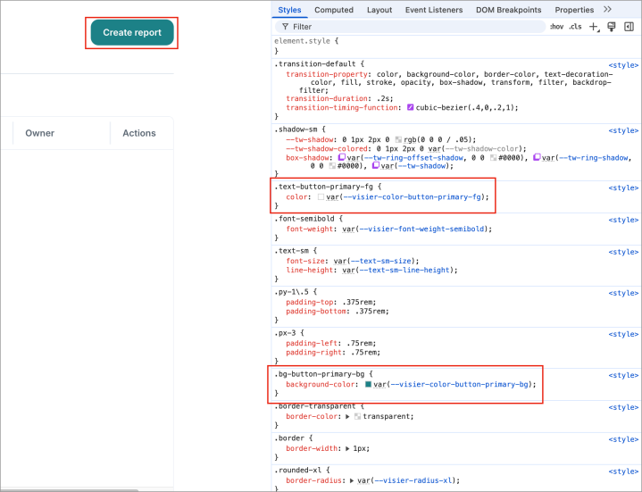
-
Optional: You can temporarily modify the CSS variables directly in the developer tools to see the immediate effect. This helps confirm you've found the correct variable.
-
Once you've found the correct variable, add the customized key-value pair to the
whiteLabelingConfigobject in your embedding script.