
Create an Internal Comparison
Understand how your team is performing compared to your peers, manager's team, and your organization.
Access requirements
Permission with these capabilities: Ad Hoc Analysis
Reach out to your administrator for access.
Overview
Note: This type of comparison is available for the Breakdown, Trend, Trend Breakdown, Table, and Relationship visuals.
When looking at metrics that quantify your HR outcomes, such as turnover rate, average compensation, or performance ratings, having an internal reference point to compare against puts your team's metrics into context so you can evaluate and optimize your team's performance. Use internal comparisons to understand how you perform against other groups in your organization. Internal comparisons show you an aggregate view of larger populations that you normally don't have data access to so your organization can share information to help make the right decisions.
Note: Internal comparison data is aggregated, therefore you will not be able to use the Detailed View visual for any internal comparison metric to see the specific population data.
There are three main internal groups that you can compare to: My Peers, My Manager's Team, and My Organization. The population of these internal groups are determined on a per user basis which allows you to compare to the internal groups that are relevant to you. For more information about these populations, see Internal comparison groups.
Comparing to internal groups is a helpful strategy when you want to evaluate if your team's performance is at an optimal level within your organization.
The following screenshot shows the Breakdown of Resignation Rate (Trailing 12 mos) vs. Resignation Rate - Internal Comparison (Trailing 12 mos) filtered to My Peers by Job Family.
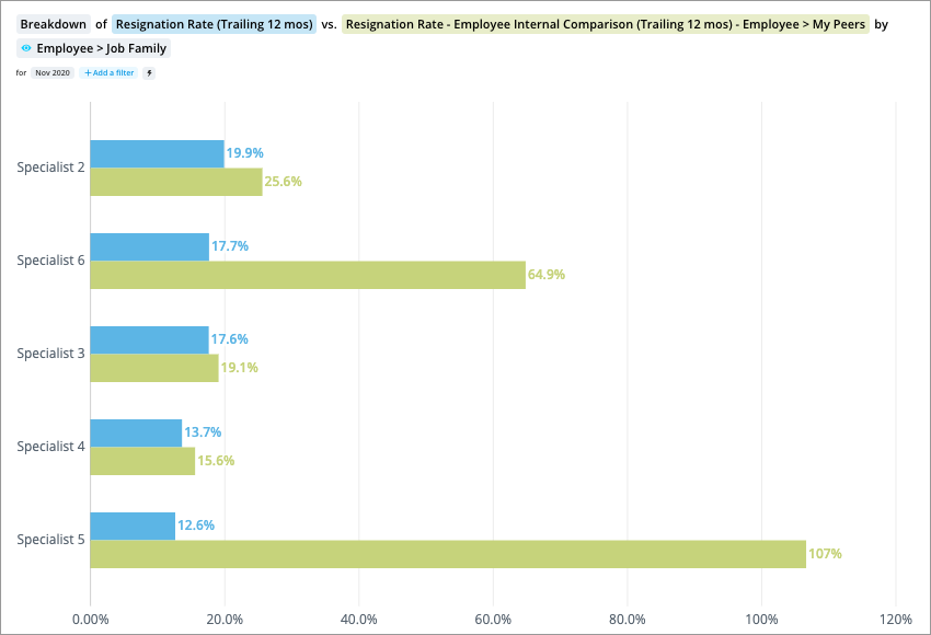
This visual shows your team's Resignation Rate against teams similar to yours in structure and purpose. This comparison provides you with more context to evaluate whether or not your metric value is optimal.
Create an internal comparison
Note: The metrics and attributes that can be used for internal comparison are configured by your administrator. Contact your administrator for more information about the internal comparisons you can do.
- In the visual title, select the key metric you want to compare. For example, Headcount.
-
Click the Compare to button
 on the Visual Actions menu to create a comparison.
 - In the Compare to panel, click Metric.
- In the Metric picker, add the internal comparator for your selected metric. For example, Headcount - Employee Internal Comparison.
- In the Compare to panel, click the Edit comparison button
 next to the internal comparator metric, and then click Add filter to refine the population you want to compare to. For example, My Peers, My Manager's Team, or My Organization.
Note: When no filters are applied, the internal comparator's default behavior compares against the entire organization.
-
To rename comparators, select the comparator in the Compare to panel, enter a display name, and click Done.
Note:
- The custom display name is used in the visual title, captures, and chart cards in an analysis.
- Changing the display name of comparators in a capture or chart card will not affect other existing captures or cards.
-
To change the comparison view, select an option under Adjust View in the Compare to panel.
Note:
- Difference and Side By Side + Difference views are only available when you have two comparators.
- You can show differences as a count or percent.
Internal comparison groups
There are three groups that you can use to filter the internal comparison metric to. The population of these groups are tied to your user profile and are defined as follows:
My Peers
My Peers includes the employees who have a reporting relationship with the direct reports of your immediate manager that are on the same level as you in the supervisory hierarchy.
If your segment of the organization consists of various teams, those peer teams are often similar to yours in structure and purpose and can make good reference points for comparison.
For example, if your team is Accounts Payable under the financial operations team, your manager may have other teams for Accounts Receivable and Payroll. Those other teams may be similar in size and perform similar duties. Comparing your team's HR outcomes to theirs can help you identify where your team is performing well and where it can improve.
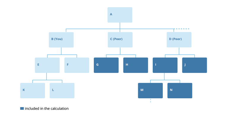
This population depends on where you are located in the supervisory hierarchy. Let's say you are logged in as Employee B, and your peers are Employees C and D. My Peers includes all of the highlighted employees that are on your peers teams, which consists of those who report directly to your peers or indirectly roll up to them:
My Manager's Team
My Manager's Team includes the employees who have a reporting relationship with your immediate manager.
As a member of a larger team, comparing your team's performance to the overall team helps you identify the areas where you are performing better or worse than average, with the population being contained to employees who generally perform similar tasks or roles as those on your own team.
For example, if your team is Accounts Payable under the financial operations team. Comparing your team's HR outcomes to the overall team, which also includes Accounts Receivable and Payroll, can help you identify where your team is performing well and where it can improve.
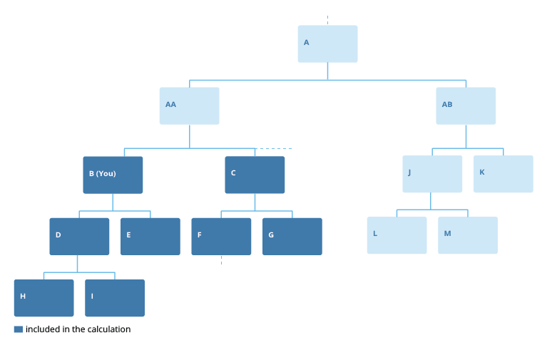
This population depends on where you are located in the supervisory hierarchy. Let's say you are logged in as Employee B. My Manager's Team includes all of the highlighted employees:
My Organization
My Organization includes the employees in the entire organization.
Comparing your team against the organization's overall performance tells you whether you are above or below average within the organization. This is useful to maintain ideal levels of performance to avoid having an underperforming team.
For example, if your team is Accounts Payable in the finance organization. Comparing your team's HR outcomes to the organization's overall average on a metric such as turnover tells you whether you are performing well, or whether there is room for improvement.
How aggregate thresholds work with internal comparisons
The aggregate threshold settings that you've configured for subjects and properties also apply to internal comparisons. This means internal comparison values are hidden if the population falls below the aggregate threshold values that are set.
Let's say you've configured the following aggregate thresholds:
- Default aggregate threshold of 5
- Analytic object threshold of 10 for Employee
- Property override threshold of 20 for Gender
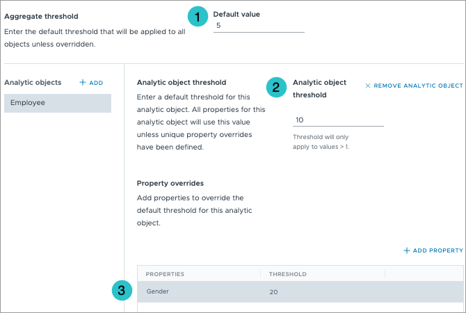
The aggregate threshold settings will apply to your internal comparisons in the following ways:
- If Gender is used in the internal comparison, the property override threshold setting will apply. In this example internal comparison values will only appear for populations that have 20 members or more.
- If the attribute used in the internal comparison does not have a property override threshold, the analytic object threshold setting will apply. In this example, internal comparison values will only appear for populations that have 10 members or more.
- If the analytic object used in the internal comparison does not have a threshold, the default aggregate threshold setting will apply. In this example, internal comparison values will only appear for populations that have 5 members or more.
For more information about configuring aggregate thresholds in Studio, see Set Aggregate Thresholds.
Synchronize metric axes
Some comparison views will show multiple charts in a single visualization. For example, you'll see multiple bar charts side by side when using the Columns view in a Breakdown visual.
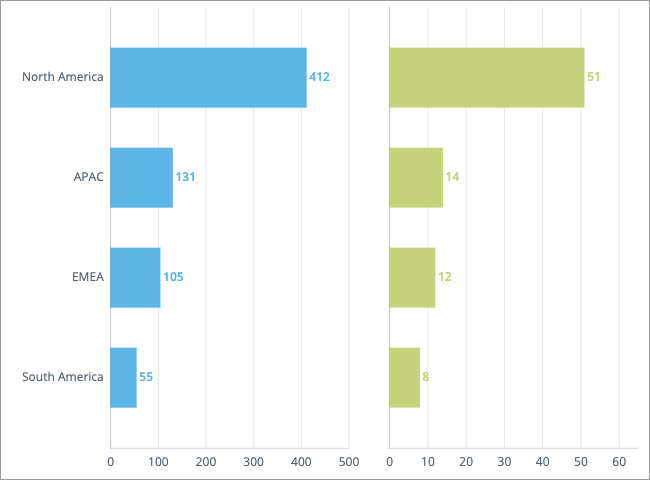
By default, the minimum and maximum scale values for each chart are automatically calculated based on its data. However, charts that have different scales can be misleading especially when they're placed side by side. For example in the preceding visualization, it appears as though the horizontal bars for North America are almost the same across the two charts. However, when you look at the actual values, you'll notice they are very different (412 and 51). To make the datasets easier to compare and help users understand the differences in magnitude, you may want to apply the same scale across all the charts.
If you want the charts in the visualization to use the same scale, turn on the Synchronize metric axes toggle in the Compare to panel under Axis options.
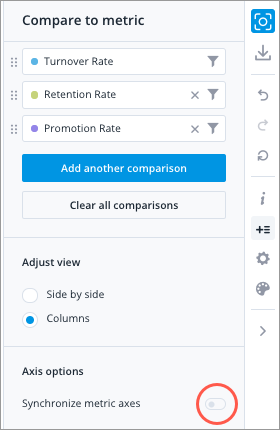
Depending on the selected view the horizontal or vertical axes will be synced:
| View | Synced Axes |
|---|---|
| Side by side & difference | Horizontal |
| Columns | Horizontal |
| Rows | Vertical |
The axis with the largest range (difference between the maximum and minimum scale values) will be used to scale the charts in the visual. In this example, the ranges for the horizontal axes are: 500 (500 - 0) and 60 (60 - 0). The chart on the left has the largest range so we scale the other chart using this range.
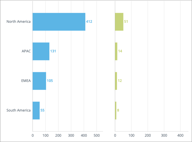
Note: Chart intervals (tick marks) are automatically added when additional space is required to show data labels. As a result, charts that have synchronized metric axes may not display the same maximum scale value. In this example, the chart on the left has a maximum scale value of 500 to accommodate the data label for North America (412). This additional space is not needed for the chart on the right so it has a maximum scale of 400.
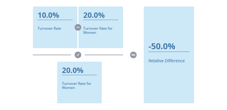
How the difference between two metric values is calculated
When comparing metric values using percentages, the relative difference is calculated by subtracting the primary (reference) metric from the secondary (comparison) metric, and then dividing the difference by the secondary metric.
For example, you want to compare the overall Turnover Rate to the Turnover Rate for women, where:
- The overall Turnover Rate is 10.0% (primary metric)
- The Turnover Rate for Women is 30.0% (secondary metric)
The relative difference or percentage change is calculated as follows:
This formula is also used when evaluating the conditional rules for analysis email delivery and traffic lighting.