
Trend Visual
Identify patterns in your data over time.
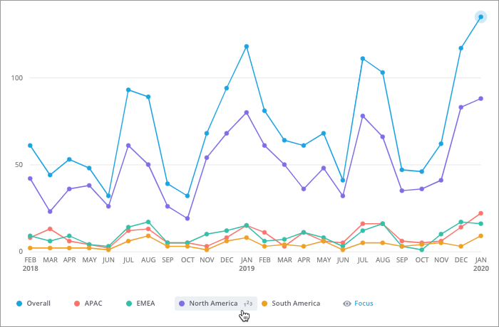
The Trend visual is a line chart that shows changes in a metric over time. The vertical axis represents a value scale and the horizontal axis represents units of time. Individual data points are plotted on the visual and connected with lines to emphasize the slope of the trend.
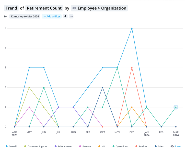
The chart is useful for exploring specific data points and identifying patterns over time. For example, the Trend of Retirement Count grouped by Employee > Organization Hierarchy is a good starting point for planning and predicting future exits.
How to explore the visual to gain insight
- Explore data points of interest and view a summary of the data in the Info panel by clicking a data point.
- View data for a specific group of employees or analysis population by adding filters.
- Add additional metrics, groups, or time periods for comparison by clicking the Compare to button
 . You can adjust the chart view to highlight the differences between the metrics and groups.
 -
Add an event annotation to mark important dates on your visual by clicking the Annotate button
 on the Visual Actions menu. For more information, see Add an Annotation.
Tip:
-
Right-click on a chart item or data point to open the Visual Item Actions menu. Find actions that will allow you to quickly interact with points of interest. Actions include drilling up or down to view different levels of your data and accessing the Detailed View visual to see a list of subject members or event occurrences that make up a given population.
-
By default, zeros, null (N/A) values, and the Others data item are hidden.
-
By default, the vertical axis will not start at zero.
-
To change the default settings, click your User icon
 > Preferences
  > Charts.
Customize the visual using the legend
You can change the appearance of the data series (lines) in your Trend chart using the legend located at the bottom of the chart.
- To show or hide a data series, click the name of the corresponding legend item.
- To change the color of a data series, click the Change color button
 to the left of the legend item.
 - To show or hide data labels, hover over the data series that you want to show data labels for and click the Toggle labels button
 . The data labels will appear in captures, analyses, and exported PDF and PPT files based on the amount of space that is available.
Tip: Legends will display the first 14 attribute values based on the visual sort order. To manage the selected attribute values, click Focus. For more information, see Add Focus.
Add traffic lighting rules
You can also highlight metric performance by applying traffic colors to the visual. For more information, see Traffic Lighting and Add Traffic Lighting Rules.