
Validate Predictions Against Actuals
Measure the accuracy of Visier's predictions by comparing them to actual results.
Overview
Visier's validation metric answers a core question for every predictive model: does a higher prediction likelihood actually lead to more real-world events?
To validate a prediction fairly, the model can't be trained on the same data it's being tested against. Visier solves this by generating a new model each year, trained only on data available up to that point. A prediction made for January of one year uses a model trained on data through the previous December.
This approach lets you validate predictions at any point in time without bias from hindsight. Understanding validation helps you assess whether a model's predictions are reliable enough to act on, and gives you evidence to back up decisions and reports built on Visier's predictive models.
Validation metrics
You can validate predictions using the following metrics and group bys in Explore:
| Prediction Model | Validation Metric | Group By Attribute |
|---|---|---|
| Resignation | Employees with Resignation Ratio (Prediction Validation) | Predicted Risk of Resignation Range |
| Internal Move | Employees with Internal Move Ratio (Prediction Validation) | Predicted Likelihood of Internal Move Range |
| Promotion | Employees with Promotion Ratio (Prediction Validation) | Predicted Likelihood of Promotion Range |
These visuals compare the actual proportion of employees who resigned, were promoted, or internally moved against what their predicted probability was.
Validate your predictions in Explore
Access requirements
Permission with these capabilities: Ad Hoc Analysis
Reach out to your administrator for access.
Use the following workflow to validate your predictions in Explore:
Note: Only the last five years of data is available for validation.
- Select the Breakdown visual.
- Select a validation metric.
- Ensure the correct Group By attribute is selected for the metric. For more information, see Validation metrics.
- Select a time period of 12 months.
Tip: We've also added a prebuilt analysis that you can review to validate the accuracy of Visier's predictions. Search the solution for the analysis named Are the talent predictions performing well?
How to interpret the prediction metrics
For each validation metric, employees are grouped by their predicted likelihoods. The employee groups are represented on the y-axis and the event rates are represented on the x-axis. The prediction range for each group is defined by the highest and lowest predicted likelihood values in the group.
We recommend that you keep the following two questions in mind when you analyze the prediction metrics:
- Do the employee groups with higher prediction likelihoods have a higher event rate than the employee groups with lower prediction likelihoods?
- Does the actual event rate for each employee group fall within its prediction range?
If the answer to Question 1 is yes: There is a positive correlation between the predictions and the actual events. The employees with a higher predicted likelihood values did indeed have a higher event rate. This means you can use the predictions to identify the employees who may require your attention.
If the answer to Question 2 is yes: You can rely on the forecasted event counts and rates to help you plan for the future.
If the answer to Question 1 is yes and Question 2 is no: The prediction is useful for identifying employees who may require your attention. However the predicted counts and resignation rates have a margin of error. This means we may predict a lower or higher value than what may actually occur.
Note:
- The visuals should always be analyzed based on a full 12-month time period because the predictions represent the probability over an entire year. If you select a time period that is shorter than 12 months then the proportion of employees with actual events occurring will be too small. If you select a time period that is longer than 12 months then the proportion of employees with actual events occurring will be too large. You can still analyze the validity of predictions for period sizes that are shorter or longer than 12 months, but you most likely see disagreement with the prediction likelihoods. However, these differences do not indicate inaccurate predictions.
- You may want to ignore validation results where the number of actual events is five or less.
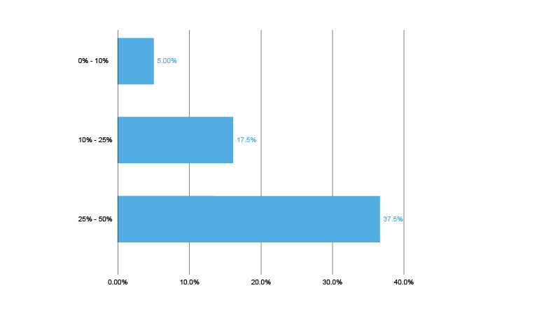
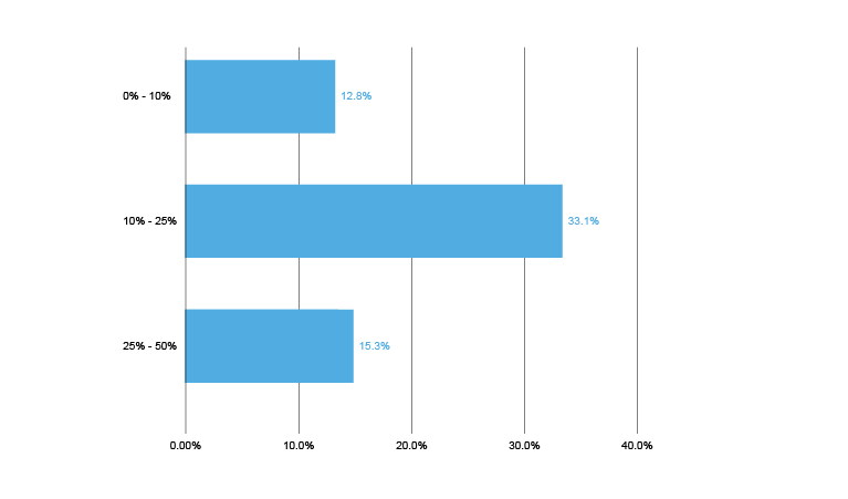
The shape of the charts should be roughly triangular, with the higher probability groups having a higher actual rate, and vice versa. If this is true, this means there is a positive correlation between the predictions and actual behavior, and you can use the predictions to identify individual employees who might need attention.
The actual values in each group should fall within the range of that group. For example, in the 10%-25% group the actual resignation rate should be between 10%-25%. If this is also true, then you can use the predictions to plan for your workforce as a whole, such as planning for recruiting needs.
You can also use custom ranges to create a more granular analysis of prediction performance. However, be aware that as you do so, the population in each group becomes smaller and may be subject to noisy results. If the actual values fall outside the labeled ranges, you can still use the predictions as a relative indication of each individual's probability of transitioning, and take action to influence it.
The following visual shows what a good result looks like. The shape of the chart is triangular, meaning the values increase as the groupings increase, and each of the values is within the range of its group.
By contrast, the following visual shows a poor result. The shape is not triangular, nor are any of the actual values within the group ranges.
Example: We made a risk of resignation prediction at the end of July 2015 and we want to see how accurate it was in predicting the actual resignation events in the following 12 months. To validate this prediction, we look at Breakdown of Employees with Resignation Ratio by Predicted Risk of Resignation Range for August 2015 to July 2016, as shown in the following illustration.
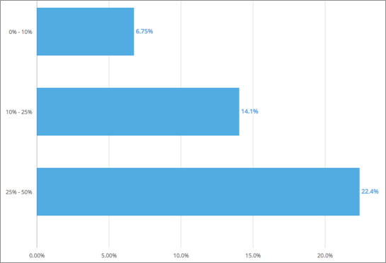
From the chart, we can see that the measured rate of actual resignations increases as the prediction likelihood increases. The employees with a predicted risk of resignation of 25-50% had a higher resignation rate than the employees with a predicted risk of exit of 0-10%. This means the employees who had higher risk of resignation values were the employees who actually left. Therefore, you can use the predictions to identify the employees who might benefit from a stay interview.
The observed resignation rates fall within the prediction ranges for each employee group. For example, the observed resignation rate (14.1%) for the employee group with a predicted risk of resignation of 10-25% is well within the lower (10%) and upper bound (25%) of the predicted range. This means you can use the forecasted resignation counts and rates to plan your organization's headcount for the next year.
However, you may want to note the forecasted resignation counts and rates for the employee group with a predicted risk of resignation of 25-50% as the observed rate (22.4%) is slightly below the lower bound (25%) of the predicted range. The resignation counts and rates may have a margin of error. In this example, our predicted resignation counts and rates may be predicting higher resignation counts and rates than what may occur.