
Chart Legend
Use the legend at the bottom of the chart to understand the data you're looking at.
Overview
When there is a need for additional contextual information, a legend will appear at the bottom of the chart, as shown in the following screenshot.
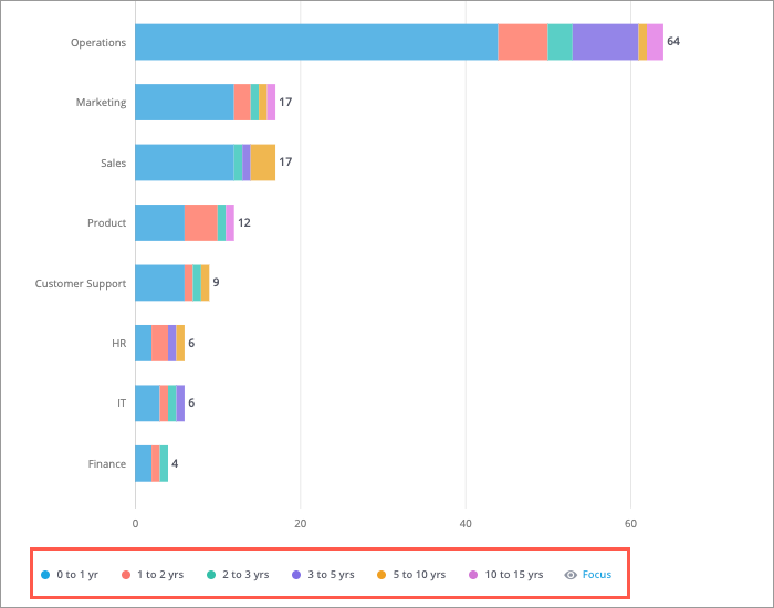
The legend will help you identify the items on the chart and explain the different colors, shapes, or patterns that are being used in the chart. Legends will display the first 14 attribute values based on the visual sort order. Any selected value that exceeds the limit will be included in the Others data item. To manage the selected values, click Focus.
Legends can appear on the Trend, Trend Breakdown, Stacked Bar, Movement Breakdown, Drivers, Quadrant, and Relationship visuals.
Note: The legend for the Organization visual will display a maximum of 10 attribute values.
Customize the Trend visual using the legend
You can change the appearance of the data series (lines) in your Trend chart using the legend located at the bottom of the chart.
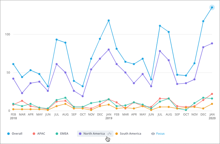
- To show or hide a data series, click the name of the corresponding legend item.
- To change the color of a data series, click the Change color button
 to the left of the legend item.
 - To show or hide data labels, hover over the data series that you want to show data labels for and click the Toggle labels button
 . The data labels will appear in captures, analyses, and exported PDF and PPT files based on the amount of space that is available.
Tip: Legends will display the first 14 attribute values based on the visual sort order. To manage the selected attribute values, click Focus. For more information, see Add Focus.