
Distribution Visual
Identify whether a data set is symmetric or skewed.
Overview
The Distribution visual shows groups of numeric values sorted from lowest to highest distributed across a range, as shown in the following illustration.
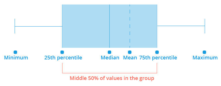
The horizontal bar is made up of segments that represent 25 percent of the values for the group. The leftmost value is the minimum for the group and the rightmost value is the maximum. The median is the middle value in the distribution. This means half the values are above the median and half the values fall below. The mean is the average value of the distribution.
The Distribution visual is accessible in Explore and Compare.
Note: The numeric attributes displayed in the Distribution visual are configured in View Details in Studio. If View details is not configured for the analytic object, the Distribution visual will return an error. For more information, see Configure View Details.
Compare an individual
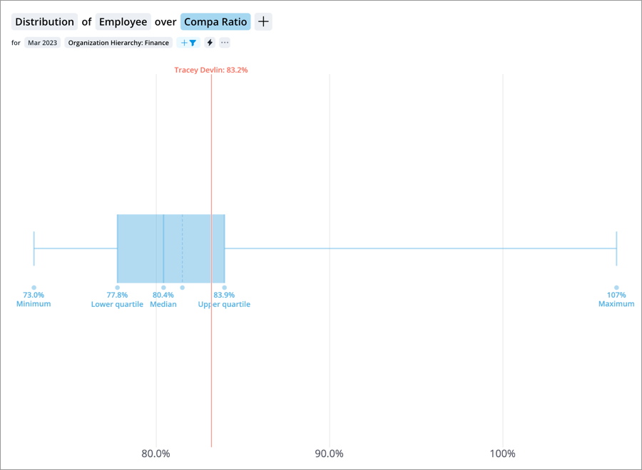
You can add an individual to the Distribution visual to compare them against the population. For example, compare how the compa ratio of an individual compares to the organization as a whole.
- In Explore, on the Visual Actions menu, click the Compare to button
 , click Employee, and select an individual.
 - In Compare, on an individual, click Pin to compare. Then, on the Visual Actions menu, click the Add comparison button
 to add a group comparison. For more information, see Compare.
The reference line indicates where the individual would sit within the distribution. By understanding the makeup of the group and the individual's difference between group attributes, you can better quantify the variance within a group. This chart is useful in making decisions about how to handle specific individuals relative to a group. For example identifying whether a high performer is paid more or less than their peers.
Compare groups
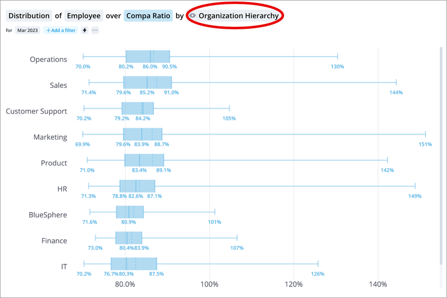
You can add a group by to the Distribution visual to compare the distribution of numeric attributes across groups. For example, you can select the compa ratio attribute and group by organizational hierarchy to compare the median compa ratio across departments.
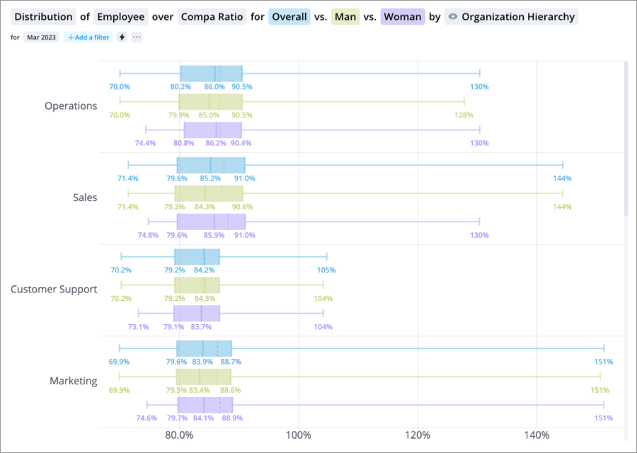
Then, on the Visual Actions menu, you can click the Compare to button ![]() , and add groups or time periods to further break down your comparison. For example, you can add men and women to compare the median compa ratio by gender across departments.
, and add groups or time periods to further break down your comparison. For example, you can add men and women to compare the median compa ratio by gender across departments.
For more information about creating comparisons in Explore, see How to Create Comparisons.
How to explore the visual to gain insight
- Add group bys to the visual to see how different groups compare to each other.
- Evaluate the distribution shape for the groups.
- Add individuals and evaluate how they compare to the distribution.