
Highlight a Group
Create a visual that compares a group's metric value to the overall metric value.
Access requirements
Permission with these capabilities: Ad Hoc Analysis
Reach out to your administrator for access.
Note: This type of comparison is available for the Breakdown, Trend Breakdown, and Movement Breakdown visuals.
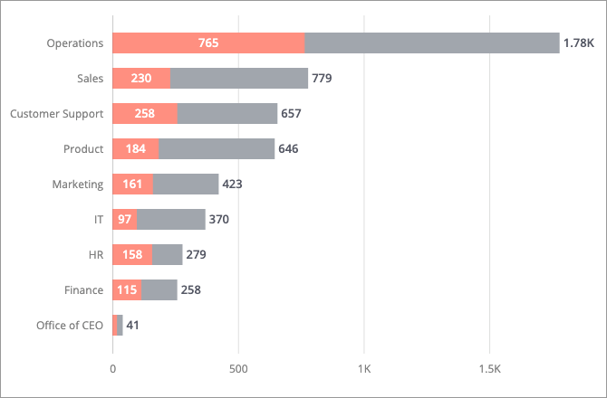
Highlight a group to quickly compare the group's metric value to the overall metric value. The comparison will appear as stacked bars. The following screenshot shows the Breakdown of Headcount for Overall vs. Woman by Organization, where the group for women is highlighted.
When a group is highlighted in the Movement Breakdown visual, the group's movement values are overlaid on top of the overall values.
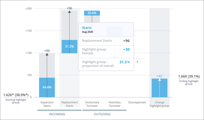
For each component, the highlighted portion of the bar shows the proportion of the group to the overall. Let's say you're looking at Employee Movement and there were 96 Replacement Starts overall and 30 Replacement Starts for the group that you've highlighted (for example, women). The proportion of the overall for the group is 31.3% (30/96). In this example, this means that 31.3% of the Replacement Starts were women. When a group is highlighted, the Insights tab of the Info panel shows the net change of the proportion of the group to the overall during the selected time context.
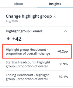
When analyzing employee movement, highlight a diverse group in this visual to see how employee movement has impacted diversity. For example, highlight women to see how the proportion of the group to the overall has changed. If the net change is negative, identify and address the individual movement components that contributed the most to the decrease in diversity. In this example, the proportion of women has increased by 0.2 percentage points during the period.
-
Click the Compare to button
 on the Visual Actions menu to create a comparison.
 - In the Compare to panel, click Highlight > Add filter.
-
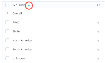
In the Filter picker, select the attribute values that define the population.
Note: Using the Filter picker in full screen
- Attribute values can be arranged into levels, so you may have to drill through multiple levels to find the value you want to include or exclude.
- Switch between the include and exclude option by clicking the Include/Exclude arrow.
- For more information, see Selecting the attribute values.
- When finished, click Apply.
-
To rename comparators, select the comparator in the Compare to panel, enter a display name, and click Done.
Note:
- The custom display name is used in the visual title, captures, and chart cards in an analysis.
- Changing the display name of comparators in a capture or chart card will not affect other existing captures or cards.
-
To add additional filters to your group, click the group you want to edit in the Compare to panel and then click Add filter.