
The Info Panel
Shows contextual information about selected metrics and data points.
Overview
Tip: Watch this video for an overview of the Info panel.
The Info panel is located on the right side of the chart as part of the Side panel. The Info panel is made up of two tabs: About and Insights. The About tab provides supporting information that will help you understand what that you're seeing in the visualization and the Insights tab provides a high level summary of the data.
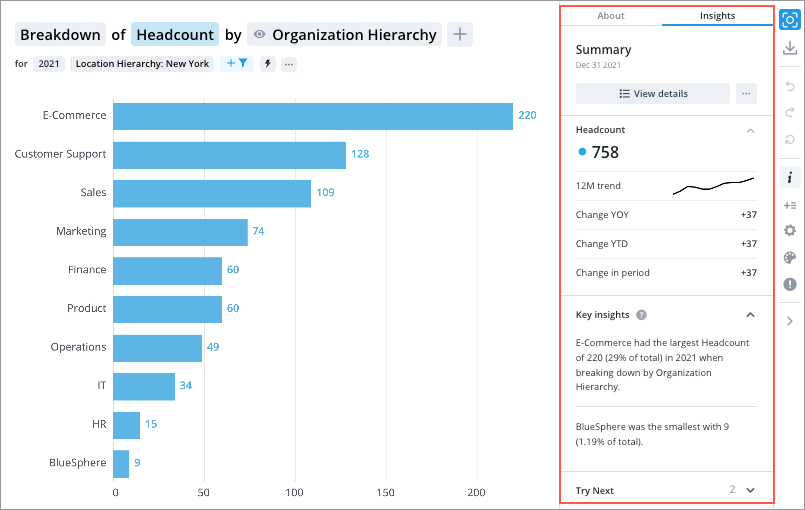
In the following example, the Insights tab on the Info panel shows the overall Headcount value (758) and key insights for your analysis context (the number of employees in New York for 2021). You'll also see a list of related metrics that you can explore next. If you click a chart item or data point, the Info panel will update to show you contextual information for your selection.
Click the Info button ![]() to show or hide the Info panel.
to show or hide the Info panel.
Info panel tabs
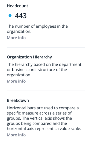
The Info panel is made up of two tabs: About and Insights. The About tab provides supporting information that will help you understand what that you're seeing in the visualization and the Insights tab provides a high level summary of the data.
About tab
When viewing a visualization in full screen (for example, selecting a chart card in an analysis or selecting a capture), the Info panel will show the About tab by default.
Note: The chart description provided by the content author will also appear in the About tab when you're viewing an analysis visualization in full screen.
The About tab can be divided into the following sections:
- Notes
- Descriptions
Notes
This section contains additional information that will help you understand what you're seeing. This section may contain information about hidden chart items, exchange rates, and guidance on how to use a visual. Click a note to see its contents, as shown in the following screenshot.
Descriptions
This section contains descriptions for the metrics, group by attribute, and visual that have been selected in the visual title. When comparing metrics, the descriptions for any applied filters will also appear.
Insights tab
When conducting analysis in Explore, the Info panel will show the Insights tab by default.
The Info panel can be divided into the following sections:
- Summary information
- Related metrics
- Key insights
- Try next
- Members
Tip:
- To cancel the selection of a data point and view the overall value, click the Deselect button
 .
. - To find additional actions, click the More button
 . For example, select High precision to display exact numbers for metric values.
 - To hide the contents of a specific section, click the Collapse button
 in the upper-right corner of each section.
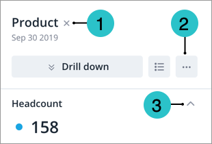
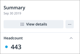
Summary information
This section shows values for the selected metrics or data points. You'll also find actions that will allow you to discover more detail about your selection. Actions include drilling up or down to view different levels of your data and accessing the Detailed View visual to see a list of subject members or event occurrences that make up a given population. For more information, see Detailed View Visual.
Note: How overall values are calculated
Overall values for metrics are calculated based on your analysis context and any filters that you've applied. The overall value will not change when you use add focus to hide specific chart items because your analysis context has not changed.
Related metrics
This section highlights metrics that will help you understand how your selected metric or data point is calculated and metrics that you should explore next.
The list of related metrics depends on the selected visual and metric. For example, if you're looking at a derived metric like Resignation Rate, you'll see the base metrics that are used in the calculation: Resignation Count (numerator) and Average Headcount (denominator).
Change metrics like the 12 month sparkline, Change YOY (Change Year Over Year), Change YTD (Change Year to Date), and Change in Period show quick comparisons and help identify trends over time.
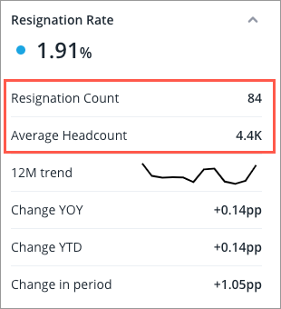
A 12-month trend sparkline (12M trend) provides a compact, visual summary of data trends over the past year, highlighting peaks, valleys, and general direction without detailed data points.
Change YOY indicates how the metric changes between years on the date selected. For example, March 31 2022 and March 31 2023.
Change YTD indicates how much the metric has changed from the beginning of the current fiscal year to the current date. For example March 31, 2023 to December 31, 2022, assuming the fiscal year begins January 1, 2023.
Change in Period compares the selected time period to the previous period. This is affected by the selected granularity, such as Years, Quarters, and Months. For example, if the selected granularity is Months and you’ve selected the March data point, then the change from February is displayed.
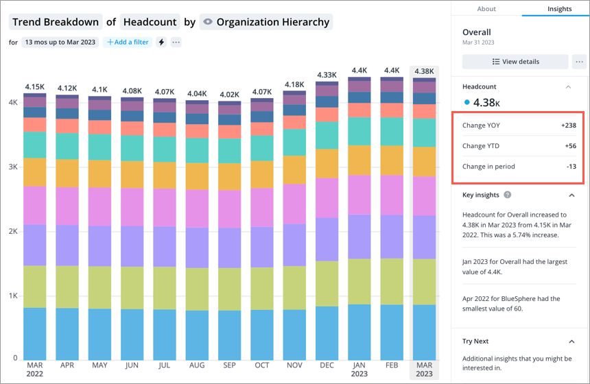
In the above screenshot the following values were used to calculate the change metrics shown for the Trend Breakdown of Headcount by Organizational Hierarchy for March 2023.
For Change YOY, the difference between March 31, 2022 (4.15K) and March 31, 2023 (4.38K) was an increase of 238.
For Change YTD, the difference between March 31, 2022 (4.33K) and December 31, 2022 (4.38K) was an increase of 56.
For Change in Period with the granularity set at Months, the difference between February 28, 2023 (4.4K) and March 31, 2023 (4.38K) was a decrease of 13.
You can explore each metric individually by clicking the value in the Info panel.
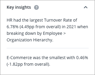
Key insights
This section provides insights generated from your visual. Key insights are generated based on interesting data in the visual, for example, which department had the highest turnover rate, as shown in the following screenshot.
Key insights are not supported in the following visuals:
- Distribution
- History
- Organization
- Pipeline Diversity
- Pipeline Trend
- Sourcing Paths
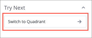
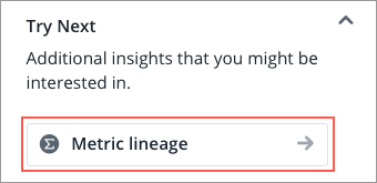
Try next
This section provides suggestions on additional insights that might interested you, such as what visual you should use in the next step of your analysis. Quickly switch to the suggested visual by clicking the button, as shown in the following screenshot.
Administrators can also find the metric lineage tool in Try Next, as shown in the following screenshot. For more information, see Validate Metric Values Using Metric Lineage.
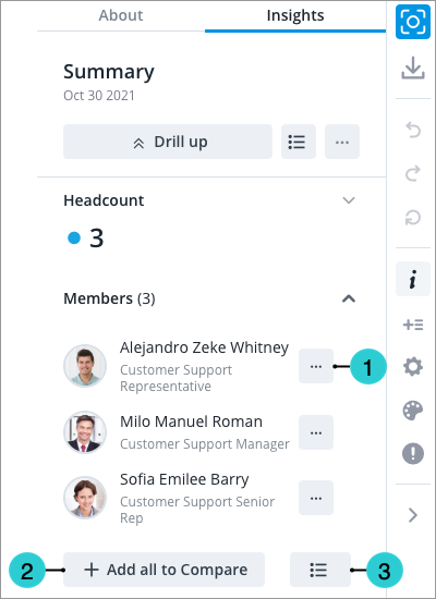
Members
Access requirements
Permission with these capabilities: View Details
Reach out to your administrator for access.
This section surfaces the individuals and occurrences behind your data points if there are five or fewer members in the population. In this section you can:
- Conduct further analysis on the member in another visualization by clicking the More actions button and doing one of the following:
- Click Add to compare to add the selected member to the Compare room. The Compare room lets you analyze the attribute values of individual subject members and groups side by side. For more information, see Use the Comparison Grid.
- Click View history to explore the attribute values for the selected member in the History visual. For more information, see History Visual.
- Click View Career Path to see the various jobs an employee can have as they progress within your organization. For more information, see Career Paths Visual.
- Add all members at once to the Compare room by clicking Add all to Compare.
- Access the Detailed View visual by clicking the View Details button
 .
.
Note:
For the Members section to appear, the following criteria must be met:
- Users must have the View Details capability.
- There must be five or fewer members in the population for the selected data point.
- The visual does not contain any comparisons. For example, the Members section will not appear if you are comparing metrics or groups.
- The visual does not contain any metrics that use a calculation concept. For example, Total Cost of Workforce or Movement metrics.
In this section