
Collaboration Circle Visual
Find out how people are working together across the organization.
Note: To enable this feature, contact Visier Technical Support.
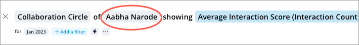
The Collaboration Circle visual allows you to explore the collaboration activity that is happening between individuals and groups during a selected period. The default metric is the Average Interaction Score metric which shows the relative frequency of collaboration between each employee and their collaborators. In the following example, the employee is collaborating with Customer Support 1.43 times more often than the average for individuals across the organization.
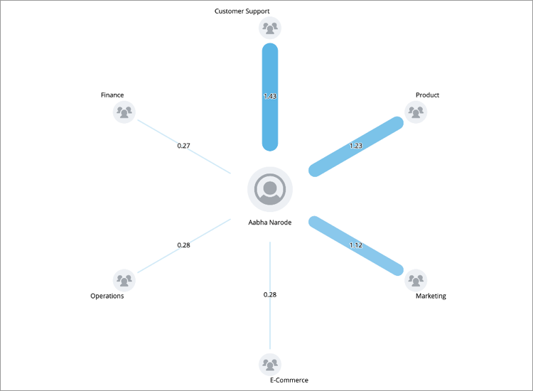
The node at the center of the visual is the employee or group of interest that you're analyzing. This is their collaboration circle and collaboration activity that you're looking at. You can adjust the population of the center and outer nodes using the visual title. The nodes on the outer edge of the visual represent the individuals and groups they have collaborated with during the selected period. The thickness of the line represents the magnitude of the primary metric. Dashed lines indicate a metric value of zero or N/A. Different colored lines will appear when there are both positive and negative metric values.
You can add a secondary metric to the outer nodes to gain a better understanding of the people and teams in the collaboration circle. For example, add headcount as a secondary metric to understand the size of the departments that your team is collaborating with.
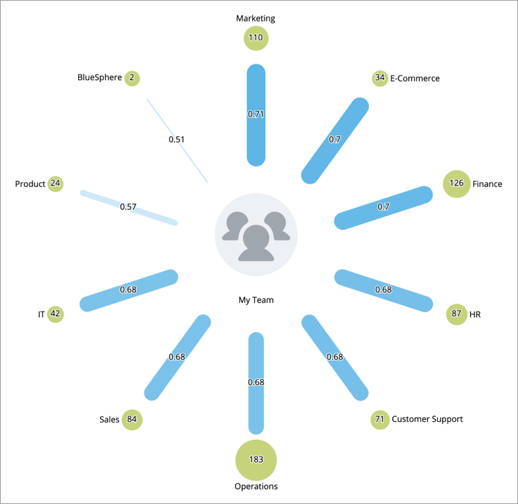
When a secondary metric is added, the size of the outer node reflects the magnitude of the secondary metric value. Outer nodes with a metric value of zero or N/A will be unshaded.
There are many ways you can use the visual to gain insight, for example:
As a manager, you can use the visualization to understand how connected your team is with other departments. Add Average Performance Rating as a secondary metric to see if there is a relationship between how much you collaborate with your direct reports and their performance.
As an individual employee, you can use the visualization to understand who you're spending the most time with and whether you're spending enough time on different aspects of work. Add Time in Job Family as a secondary metric to see who has the most experience in your collaboration circle and how much you're interacting with them. You can also add Average Collaboration Circle Size as a secondary metric to see which of your collaborators has the largest collaboration circle.
How to explore the visual to gain insight
- Set the time period of analysis using the Time picker.
- Select the person or group you want to analyze collaboration for using the Center Node picker in the visual title.
- Define the population of the outer nodes by selecting a group by attribute. For example, group by Full Name to see the individuals in your collaboration circle or group by Organization to see the department or business units that you've worked with.
- Add a secondary metric by clicking the Add button
 in the visual title or the Compare to
  button in the Visual Actions menu. The metric is calculated for the population on the outer nodes.
Change the center node
Tip: Quickly analyze the collaboration of an outer node by double-clicking it.
-
Click the Center Node picker in the visual title. Depending on the previous selection, the center node will show the name of an employee or a group.
- In the Center Node picker, do one of the following:
- To view the collaboration circle for an employee, click Select an employee.
- Search for the employee by name.
- Select the employee from the search results.
- To view the collaboration circle for a population, click Select group.
Click Add filter.
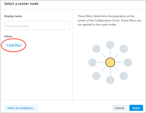
- In the Filter picker, select the attribute values that define your group. For more information, see Define the Filter Criteria.
- Filters will not be applied to the outer nodes.
- Add a display name for the group.
- When finished click Apply.
- Optional: Apply filters to the outer nodes to see data for a specific analysis population by clicking Add a filter
 on the Analysis Context toolbar. For example, if you want to analyze data for employees located in North America, you would add a filter using the Location Hierarchy attribute and select the North America value. For more information, see Define the Filter Criteria.
- To view the collaboration circle for an employee, click Select an employee.