
Create a Dynamic Template
Author AI-powered analyses that deliver targeted and relevant insights to a large population of users.
Access requirements
Permission with these capabilities: Visier AI Insights
Reach out to your administrator for access.
Overview
Visier harnesses the power of machine learning and AI to enable dynamic storytelling. AI analyses use smart algorithms to create insights that deliver well-timed information to your users. For example, you might use an AI analysis to alert your people leaders to employees at risk of exit after a similar employee leaves the organization.
You might want to use AI analyses if you're serving a large and varying consumer population. Non-AI analyses are great for answering specific questions for a small group of users, but may become too general if your audience is a diverse set of leaders with different problems to solve. By authoring a dynamic template, you'll ensure that the analysis changes to fit the needs of whoever accesses it.
Best practices
Keep the following best practices in mind when creating AI analyses.
Use dynamic text to let the template fill in information for you
You can use getSummary and getSize to create dynamic text in your dynamic templates. For example, to dynamically fill in the individuals in your trigger population, use {triggerPopulation.getSummary()} in your analysis description. To dynamically fill in the number of individuals in your trigger population, use {triggerPopulation.getSize()}.
Define populations at the global level
In the template's global level, define populations in the Edit dynamic analysis properties dialog. This allows you to define a population once and reuse that definition throughout the template wherever you use a population.
Use population functions in your dynamic chart transforms
Dynamic chart transforms allow you to use population functions to build powerful dynamic visualizations that change based on the viewer's context.
Important terminology
To author AI analyses, the following terms are important to understand.
General
The following terms define more general terminology associated with dynamic templates.
dynamic template
An analysis that contains dynamic elements. A template is the mold from which AI analyses are generated for users.
filter
One or more attribute values to include or exclude from the population. For example, you can filter the trigger population to a particular attribute, such as Job Name.
lists of filters
A collection of filters that combine to include or exclude attribute values from the population. For example, you can filter the population to match a particular Job Name in one filter, then add another filter to select the population by Location.
trigger filter
The reason that an AI analysis is generated and emailed to relevant stakeholders. The trigger filter for a dynamic template is configured in the email push schedule. For example, a trigger filter could be that an employee exited the organization or that an applicant's application journey has been stagnant for more than 15 days.
scope filter
The population to filter the AI analysis by when generated. The scope filter for a dynamic template is optional and is configured in the email push schedule. For example, you can add a scope filter to change the population that a user will see after opening an AI analysis. If the scope filter is blank, the default is to filter to the user's team.
Populations
A population is the individuals relevant to the analysis. The following terms define different populations used in AI insights.
trigger population
The individual or individuals that triggered the AI analysis to generate, such as an employee in your team who exited the organization. You can toggle whether or not a trigger population is required to populate an insight analysis in the Edit dynamic analysis properties dialog. If a trigger population is required, the scope population filters are applied to the trigger population.
scope population
The individuals that you have access to. You can add additional filters to narrow the scope population even further. For example, a manager might filter the scope population to the employees that directly report to the manager.
focus population
The individuals that display in a dynamic visualization. For example, the focus population for regrettable employee exits could be the trigger population and individuals in the scope population that exited in the previous three months.
related population
The individuals who are similar to the trigger population, such as team members whose time since promotion is close in value to the trigger population's.
Properties
Properties are qualities of an analytic object. The following terms are different property types associated with AI insight generation.
distinguishing property
A meaningful attribute that differentiates individuals in the population. Distinguishing properties are used for AI insight analyses. For example, if everyone is in the Sales organization, then the attribute Organization Hierarchy will not distinguish any of the individuals from each other. Instead, Tenure is a property that differentiates Sales employees from each other.
To enable useful distinguishing properties, you must configure the Properties for the subject in the AI Configuration tab of an analytic object. For more information, see Configure AI Attributes.
similar change property
An attribute that changed in a similar way for the population, like Span of Control change. Similar change properties are used for AI insight analyses.
To enable useful change properties, you must configure the Change Properties in the AI Configuration tab of an analytic object. For more information, see Configure AI Attributes.
Get started with dynamic templates
The best way to start authoring a dynamic template is to know what story you're trying to tell. With a targeted business question, you can build a narrative through dynamic storytelling that answers the questions your leaders are asking.
When you have your use case, you can think about the journey that a user might follow to answer their questions about the topic. For example, if you're authoring a dynamic template to assist leaders after recent turnovers, you might prepare dynamic visualizations that explore where the organization sees the most turnover, how those exits impact your diversity, equity, and inclusion goals, and what revenue loss you're facing due to the exits.
Visier applies conditional pushes, trigger populations, scope populations, and AI algorithms to make analyses dynamic. As explained above, a conditional push is the condition that must be met to generate an AI analysis, a trigger population is the individual or individuals that met the conditions and triggered the AI analysis to generate, and the scope population is the set of individuals that are relevant to the user receiving the AI analysis. By combining conditional pushes and populations with algorithms, you can build powerful AI analyses to send to stakeholders.
Create or duplicate an existing dynamic template
Create a new template to provide AI analyses to your users.
Step One: Create an analysis
Tip: Instead of creating a new dynamic template from scratch, try duplicating a Visier-provided AI insight analysis. In the duplicated analysis, you can edit the title, descriptions, dynamic template formulas, and dynamic visualizations to author a unique template from a pre-made base analysis.
-
In a project, on the navigation bar, click Model > Analyses.
- Do one of the following:
- Click Create Analysis.
- Select an existing insight analysis and then click Duplicate.
- Type a display name and description.
Tip: In the Description box, you can use dynamic text. For example, "Discover employees who have a high risk of resignation due to the recent departure of {triggerPopulation.getSummary()}" would become "Discover employees who have a high risk of resignation due to the recent departure of Abigail Smith" if Abigail triggered the analysis. To add a dynamic description, your populations must be defined in the dynamic template formulas editor, described next.
Step Two: Make the analysis dynamic
Make the analysis dynamic by adding parameters, formulas, or transformations. You can also write analysis-wide formulas and add analysis transformations.
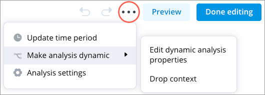
To make the analysis dynamic, open the Analysis Editor and then click the More items button ![]() . Hover over Make analysis dynamic and then click Edit dynamic analysis properties.
. Hover over Make analysis dynamic and then click Edit dynamic analysis properties.
Add parameters to the analysis
Analysis parameters are variables defined at the analysis level that can be used in different parts of the analysis such as visualization metrics and the analysis context. Analysis parameters allow the user to control the parameter values based on their needs and use cases.
- In the Edit dynamic analysis properties dialog, click Parameters > Add a parameter.
- Set the parameter type.
- If Filter, set the subject.
- If Numeric, set the starting default value.
- If Plan, set the plan type.
- Type a parameter variable name.
- Type a parameter display name.
- Optional: Type a parameter description.
- When finished, click Save.
You can then add these parameters to visualizations within the analysis using dynamic chart transformations. For more information, see Dynamic chart transforms.
Add insight parameters to the analysis
If you created a new analysis (rather than duplicating an existing analysis), do the following:
- In the Edit dynamic analysis properties dialog, click Insight Options.
- Turn on Include Insight Parameters.
- Select a subject from the list.
- Optional: Add a filter to the scope population and type a description to help guide users. Users will be able to change the scope population filter when viewing the analysis.
Note: To lock the filters, select Prevent users from changing scope population value. If selected, users will not be able to remove or modify the scope filters that you set. Users can still add other filters to the analysis.
Filters allow you to narrow the scope population even further. For example, in a high resignation risk analysis you might only be interested in the high performers on your team. In this example, you could add the filter High Performer to your scope population.
- Optional: If the analysis requires a trigger population, turn on Require a trigger population. You can add optionally add a filter and a description to help guide users. Users will be able to change the trigger population filter when viewing the analysis, such as to select a specific employee to be the trigger population.
Note: To lock the filters, select Prevent users from changing trigger population value. If selected, users will not be able to remove or modify the scope filters that you set. Users can still add other filters to the analysis.
By adding a trigger population filter, you enable the user to always see content when they first open the analysis. For example, in an Employee 360 analysis, you might set the trigger population filter to the Me key group, which will show the user data about themselves when they open the analysis.
- When finished, click Save.
Write analysis-wide formulas
You can add formulas to define the variables and populations to use in the dynamic analyses, such as the focus population and the related population. A dynamic template will work without any populations defined, however, we recommend that you define populations at the global level so that you can use dynamic text and reuse the population definitions throughout your analysis.
As a starting point, define your focusPopulation and relatedPopulation. Defining these populations will give you a focus population to use in your dynamic visualizations and a related group of individuals to analyze in the insight analysis. By defining the populations, you can reuse the populations in various chart transforms in the analysis without recomputing them every time. These formulas provide the dynamic template with rules to populate dynamic visualizations that are relevant to the viewer.
Define populations in the Analysis-wide dynamic expressions field as variables using :=.
In the above example, the focus population is equal to the trigger population plus the scope population. These variables can then be used in dynamic chart transforms and take the definition from the dynamic template formula.
- In the Edit dynamic analysis properties dialog, click Formulas.
- In Analysis-wide dynamic expressions, define the variables and populations for the analysis. For more information, see Population functions below.
- In Validity criteria, define the criteria with which to validate the dynamic expressions. For example, the validity criteria might be that the focus population and related population must each be larger than 1.Copy
focusPopulation.size() > 1 && relatedPopulation.size() > 1 - When finished, click Save.
Example:
The following screenshot shows an example of a dynamic template that explores employees who have a high risk of resignation due to the recent departure of the trigger population.
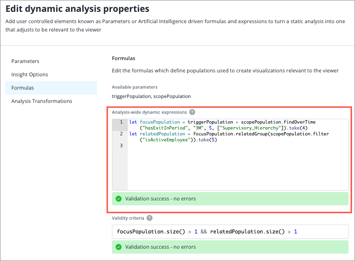
The following dynamic template formulas are used.
focusPopulation := triggerPopulation + scopePopulation.findOverTime("hasExitInPeriod", "3M", 5, ["Supervisory_Hierarchy"]).take(4)In the above example, the focus population is defined as the trigger population plus the top 4 individuals who exited during the last 3 months in the scope population. A focus population is the value to look for commonalities among the members of this group: people who have recently exited.
relatedPopulation := focusPopulation.relatedGroup(scopePopulation.filter("isActiveEmployee")).take(5)In the above example, the related population is defined as a group of 5 individuals in the scope population who are similar to the focus population and are also active employees. In this dynamic template, the expanded population represents the those who meet the criteria within the scope population minus the trigger. Related population is an example of commonalities among the group. In this example, it is defined as current employees who are a related group to the focus population. In other words, AI algorithms find employees who are similar to those who recently exited.
Example: Compare one employee to a group of their peers to assess pay equity
In this example, the employee to compare is the trigger population. To set a particular employee as the trigger population, do one of the following:
- Select the employee in Detailed View. In the Info panel, open the Insights tab and click Try Next. Any dynamic analyses that uses the Employee subject will be available to select.
- In the dynamic analysis, set the trigger population parameter to select that employee.
As the dynamic template author, you don’t need to set any other parameters. To create the group of peers, you must set the attributes that make someone a peer to the person of interest. In this example, a peer is anyone with the same job family and country as the trigger population employee.
Step One: Define the variables
First, define the attributes of the employee to compare (the trigger population) in the Analysis-wide dynamic expressions.
let jobFilter = triggerPopulation.getGeneralizedFilters(["Job_Name"])
let locFilter = triggerPopulation.getHierarchyMembersFilters("Location", 1, 2)[0]Step Two: Apply filters to the employee population
Next, apply the filters one at a time to the entire employee population until you get a set of peers. In the first filter, scopePopulation is the automatic variable of everyone that the user can see. Then, the formula filters the result result of the previous line. This is a progressive and filter.
let jobPopulation = scopePopulation.filter(jobFilter)
let jobLocPopulation = jobPopulation.filter(locFilter)This pattern of one-by-one filtering is useful if you have many criteria. For example, notice how jobPopulation appears on both lines. If you had a third filter, the third line would use jobLocPopulation.filter(thirdFilter).
Step Three: Remove the trigger employee from the group of peers
The final population (jobLocPopulation) includes the employee to compare, so you must remove the trigger population to get a group of peers that doesn’t include the employee of interest.
let peerPopulation = jobLocPopulation - triggerPopulationAs a result of these formulas, you can use peerPopulation in chart transforms, such as by setting them as the filter context (change context), a comparison group, or a reference line.
Add analysis transformations
Analysis transformations allow you to optionally replace analysis-level elements with another dynamic value.
- In the Edit dynamic analysis properties dialog, click Analysis Transformations.
- Optional: Set the Analysis filters expression. This sets the filters for the analysis dynamically. You can use any expression that will result in a filter.
For example, let's say you want to filter the analysis by Location > Canada. To do so, you can create a filter parameter called locationCanada on the analysis that filters Employee to Location > Canada. In Analysis Transformations, you can then type locationCanada in the Analysis filters expression field. All data in the analysis will be filtered to Canada.
- Optional: Set the Analysis time expression. This sets the time context dynamically. You can use any expression that will result in a time interval. If set, this expression overrides the driving subject and all time handling set manually in the analysis. If not set, the analysis does not dynamically shift time.
For example, let's say that you want to set the time context to 1 year previously. In the Analysis time expression field, you can type subjectTimeInterval("Employee").shift("-1y"). Employee data in the analysis will be shifted back by 1 year.
- Optional: Set the Driving analytic object expression. This sets the driving analytic object, such as Employee, dynamically. You can use any expression that will return an analytic object, such as an object name, the subject returned from a population, or the subject returned from a plan parameter.
For example, if you want Employee to be the driving analytic object, you can type "Employee" in the Driving analytic object expression field. Employee is the object name of the Employee subject.
- When finished, click Save.
Example: Set the analysis time expression to update dynamically
The following example sets the time context to show all time on the time slider in the dynamic analysis. By itself, subjectTimeInterval is a time range.
subjectTimeInterval('Employee', periodType='M', excludeIncompletePeriod=true)The following example sets the time context to only show the latest month on the time slider in the dynamic analysis. Using .withLength changes the subjectTimeInterval time range into a point in time.
subjectTimeInterval('Employee', periodType='M', excludeIncompletePeriod=true).withLength('1M', anchor='End')Step Three: Add dynamic visualizations
Dynamic visualizations are visualizations with chart transformations applied. Chart transforms modify visualizations to focus on the populations you have defined, such as relatedPopulation.
- To add a visualization to the template, click the Insert button
 > Chart.
 - After the visualization is added, click the Make dynamic button
 . This allows you to add dynamic elements to the visualization. For more information, see Dynamic chart transforms.
 - Repeat the above steps until your analysis is complete.
Example: A Comparison that uses chart transforms to retrieve employees with the longest tenure in the related population
A Comparison visualization may be configured with a Set comparison entities chart transformation, using the following formula for the Individual members expression:
relatedPopulation.topN(2, "Employee.Tenure", true)This formula retrieves the two employees with the longest Tenure in the related population. This is dynamic; the selected employees will differ by the user viewing the analysis.
Example: Set the context on a Trend Breakdown visualization to understand the sales contribution history of your relatedPopulation
relatedPopulation must be defined in your dynamic template formulas. For more information, see Step Two: Make the analysis dynamic.
- To add a Trend Breakdown to the template, click the Insert button > Chart > Create new chart.
- To set up the visualization, do the following:
- Click the Visual picker and select Trend Breakdown.
- Click the Metric picker and select Sales Revenue Closed.
- Click the Group By picker and select Full Name.
- Click Add and Close.
- After the visualization is added, hover over the visualization and click the Make dynamic button .
- In the Dynamic chart transforms dialog, click Add a new chart transform and then select Change context.
- Under Change context, in the Population or Filter expression field, type relatedPopulation.
- Click Apply.
Result: The visualization is dynamic; viewers will see a Trend Breakdown of employee sales contributions for their related population.
Example: Display a comparison of the distinguishing properties for your relatedPopulation focusing on the most senior members
relatedPopulation must be defined in your dynamic template formulas. For more information, see Step Two: Make the analysis dynamic.
- To add an employee comparison to the template, click the Insert button > Chart.
- In Captures, select an employee comparison capture.
Note: You must first create a comparison and capture it to use it in an analysis. For more information, see Compare.
- Click Add.
- After the visualization is added, hover over the visualization and click the Make dynamic button .
- In the Dynamic chart transforms dialog, click Add a new chart transform and then select Set comparison entities.
- In the Set comparison entities transform, do the following:
- In the Individual members expression field, type relatedPopulation.topN(2, "Employee.Tenure", descending=true)[0].
- In the Groups expression field, type relatedPopulation.topN(2, "Employee.Tenure", descending=true)[1].
- In the Dynamic chart transforms dialog, click Add a new chart transform and then select Set comparison properties.
- In the Set comparison properties transform, in the Properties expression field, type relatedPopulation.distinguishingProperties(scopePopulation, 10).
Result: The visualization is dynamic and will choose up to 20 properties (10 categorical, 10 numerical) that best distinguish the related population from the scope population, with the individuals ordered by highest tenure.
Example: Choose an interesting group by for a Breakdown of Compa Ratio by Age Range from a list of group by options
relatedPopulation must be defined in your dynamic template formulas. For more information, see Step Two: Make the analysis dynamic.
- To add a Breakdown to the template, click the Insert button > Chart > Create new chart.
- To set up the visualization, do the following:
- Click the Visual picker and select Breakdown.
- Click the Metric picker and select Compa Ratio.
- Click the Group By picker and select Age Range.
- Click Add and Close.
- After the visualization is added, hover over the visualization and click the Make dynamic button .
- In the Dynamic chart transforms dialog, click Add a new chart transform and then select Change context.
- Under Change context, in the Population or Filter expression field, type relatedPopulation.
- In the Dynamic chart transforms dialog, click Add a new chart transform and then select Change group by.
- Under Change group by, in the Axis dimensions expression field, type ["Age_Ranges", "Employe_Tenure_Year", "Gender", "Base_Pay_Ranges"].
- Under Change group by, in the Max number of charts to produce field, type 1.
Result: The visualization is dynamic; based on Visier's AI algorithms, the group by will be changed to select the most interesting visualization.
If you want to produce a row with the top 3 interesting visualizations, do the following:
- Under Change group by, in the Max number of charts to produce field, type 3.
- Under Change group by, in the Layout for multiple charts field, select rows.
Step Four: Make the analysis visible to users
When you finish authoring the analysis, you can then make the analysis visible to users.
- Add a topic to the analysis. For more information, see Add Topics to an Analysis.
- Publish the dynamic template to production. For more information, see Publish Project Changes.
- Create an email push for the analysis. For more information, see Set up an email push schedule for a dynamic template.
Note: If the a trigger and scope population are defined, the analysis may appear in the Detailed View visual under Try Next if the subject is the same in the analysis and Detailed View. For example, when looking at Detailed View for a Breakdown of Headcount by Organization Hierarchy, which uses the Employee subject, a dynamic analysis that uses Employee for the trigger and scope population will appear under Try Next. In this example, the selected employee in Detailed View will be the trigger population and the listed employees will be the scope population.
Validate a dynamic template
There are multiple validation methods for dynamic templates:
- As a dynamic template author, you can validate the formulas you've written in the analysis to ensure they're accurate and usable.
- As a dynamic template author, you can preview the template as a user to see how it looks to a viewer.
- As a dynamic template author, you can create a test email schedule and send it to yourself to ensure the template works as intended.
- As an analysis viewer, you can validate the visualizations that were generated for or dropped from the AI analysis.
Validate the formulas you've written in an analysis
- Navigate to a template that you authored and open the Analysis Editor. For more information, see Analysis Editor.
-
In the top-right corner, click the Validate button
 .
.Result: The platform will validate for a few moments and then provide a success or failure message.
Preview the template as a user
- Navigate to a template that you authored and open the Analysis Editor. For more information, see Analysis Editor.
- In the upper-right corner, click Preview.
- You can preview the template as yourself or any other user you have access to preview.
- Review the generated analysis to confirm that it's working as intended.
Create a test email schedule and send it to yourself
- Publish the template to production. For more information, see Publish Project Changes.
- Open the solution experience and open the dynamic template through Search or Guidebooks.
- In the analysis, click the Schedule email delivery button
 in the upper-right corner.
 - Create an email schedule and send it to your own email. For more information, see Set up an email push schedule for a dynamic template.
Note: Send it to the email associated with your Visier account. This ensures that you can access the generated analysis in Visier.
Validate the visualizations that were generated for or dropped from the AI analysis
- Open or preview an AI analysis. You may need to preview the analysis as a user. For more information, see Preview the Solution as a User.
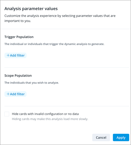
- Optional: If required, set the analysis parameters, as shown in the following screenshot.
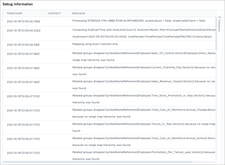
- To understand why visualizations did or did not appear in the analysis, click the Show debug information button
 in the top-right corner of the analysis.
Result: A dialog opens that shows why properties were selected or dropped from the analysis, as shown in the following screenshot.
Dynamic chart transforms
Adding dynamic elements to your visualizations enables a dynamic template to create user-specific insights for your team.
Dynamic chart transforms use population functions and configuration settings to create unique filters on the visualization. For example, you can use a dynamic chart transform so that a visualization will show the top 5 individuals in the related population.
In the Dynamic chart transforms dialog, the headings represent the types of chart transformations you can perform, as shown in the following screenshot.
![]()
- Dynamic chart transform type: A category of transformation that you can apply to the visualization.
- Dynamic chart transform parameter: A parameter that can be modified for the chart transform.
- Transformation: The formula expression or configuration option to use for the transform parameter.
- Dynamic chart settings: An optional setting to add additional dynamic chart transforms.
Note: The types of dynamic chart transformations differ by visual type, meaning that not all transformations are available in each visual type.
The following table defines the current dynamic chart transformations that you can use to make your analyses dynamic.
| Dynamic chart transformation | Description | Visual types |
|---|---|---|
| Change context |
Define a different context for the visualization, such as a population or filter, subject reference, time expansion, or filter mode. relatedPopulation |
|
| Change group by |
Define a different group by for the visualization, such as organization hierarchy, job name, and employee tenure. For example, if you have a scope or trigger population, you can define a different group by as follows: ["Organization_Hierarchy", "Job_Name", "Employe_Tenure_Year"] Note: The scope or trigger population must use the same subject as the defined group bys. In the above example, the scope or trigger population must be Employee. For example, if there isn't a scope or trigger population, you can define a different group by as follows: Dimensions("Employee", ["Job_Name", "Job_Family"]) |
|
| Choose group comparisons |
Define the groups to use in the visualization, such as recently exited employees who are categorized as regrettable, female, high performer, top talent, and tenure of 0-1 years. ["isRegrettable", "isFemale", "isHighPerformer", "isTopTalent", "Tenure_0_1_Year"] |
|
| Replace filter |
Define a filter that should be replaced in the visualization by other filter candidates, such as replacing isHighPerformer with isManager or isFemale. In Field to replace, type "isHighPerformer". In Filter candidates, type ["isManager", "isFemale"]. |
|
| Set annotations |
Add annotations for each of the population time periods on the visual and align the context to match the population. If multiple populations are given, 1 visual is produced for each unique context. Bonus Payout |
|
| Set comparison entities |
Define the individual or group entities used in the visualization to compare against other values, such as the first two values for employee tenure in the related population. The Individual members expression expands to each person as an individual member in the visualization, while the Groups expression is a single entity containing all members. relatedPopulation.topN(2, "Employee.Tenure", true) |
|
| Set comparison properties |
Define the properties and the layout to display those properties used in the visualization to compare against other values, such as the focus population against similar change properties in the scope population. focusPopulation.similarChangeProperties(scopePopulation) |
|
| Set custom value reference line |
Add a reference line to the visualization to summarize or compare data. If using an analysis parameter, set the custom value as the parameter variable name. For more information about reference lines, see Add a Reference Line. To set the reference line color, set the Color Indices. The Color Indices uses the selected color palette for the visual. Type a number to select a color in the color palette where 0 is the first color in the palette, 1 is the second color in the palette, and so on. If empty, the default color is the first color in the palette. Note: If creating multiple reference lines, you can assign colors to each reference line separated by a comma; for example ["0, 1, 2"]. |
|
| Set focus members |
Use a population or filter parameter to focus on specific members. To set an employee as the focus, use a population parameter. To set a Job Name or Job Family as the focus, use a filter parameter. Each member creates a separate visual. triggerPopulation |
|
| Set metric parameter value | Set a parameter value for a metric in the visualization. The metric must already be configured to accept parameters. For more information, see Parameters (optional). |
|
| Set reference line |
Define a reference line for the visualization. To set the reference line color, set the Color Indices. The Color Indices uses the selected color palette for the visual. Type a number to select a color in the color palette where 0 is the first color in the palette, 1 is the second color in the palette, and so on. If empty, the default color is the first color in the palette. In Filter candidates, type ["isFemale", "isMale"]. In Display Names, type ["Women", "Men"]. |
|
| Set subject members |
Define the subject members and the layout to display those members in the visualization, such as the trigger population in a carousel display. triggerPopulation |
|
| Set traffic lighting reference | Define traffic lighting for the visualization, including filters, display names, and optional subject references and metrics. |
|
| Use smart time | Allow the Visier platform to select the time period for you. |
|
Example: Use chart transforms to replace existing filters
Let's say you want to replace one of the existing filters in a visualization with the best filter from a list of potential filters. Let's say you have a Breakdown of Headcount by Organization Hierarchy filtered by Woman (isFemale) and High Performer (isHighPerformer). However, you want to use a chart transform to replace the Woman filter with the best filter from the following filter candidates: Man (isMale), US (isUSOnly), and Generation X (isGenerationX).
First, add a chart transform to the visualization:
- Hover over the visualization and click the Make dynamic button .
- In the Dynamic chart transforms dialog, do the following:
- Click Add a new transform > Replace filter.
- In the Filter to replace field, type a zero-based index, the object name of a filter, or the name of the hierarchy that the filter is on. In this example, to replace Woman, type 0. Alternatively, you can type "isFemale".
Note: If no Filter to replace is specified, the new filter is appended to the existing filters.
- In the Filter candidates field, type ["isMale", "isUSOnly", "isGenerationX"].
- When finished, click Apply.
When a user views the analysis, this visualization will dynamically select the best filter to replace Woman.
Example: Use chart transforms to add a reference line to a visualization
Let's say that in a Breakdown of Turnover Rate by Organization Hierarchy, you want the visualization to dynamically add a Women or Men filter and then add a reference line for the selected group.
First, add a chart transform to the visualization:
- Hover over the visualization and click the Make dynamic button.
- In the Dynamic chart transforms dialog, do the following:
- Click Add a new transform > Set reference line.
- In the Filter candidates field, type ["isFemale", "isMale"].
From this list, the visualization will dynamically select the best filter.
- In the Display Names fields, type ["Women", "Men"].
These are the reference line display names.
- When finished, click Apply.
When a user views the analysis, this visualization will dynamically select the best filter between Women or Men, and then add a reference line for the filter.
Example: Use chart transforms to set metric parameters
Let's say you have a Breakdown of Retirement Eligibility by Organization Hierarchy in an analysis. In this visualization, you want users to be able to adjust Retirement Eligibility to any age they want. Because the Retirement Eligibility metric is already configured to accept parameter values for Age, you can use analysis parameters and chart transforms to allow users to set the age of Retirement Eligibility. For more information about metric parameters, see Create a Metric.
First, add the parameter to the analysis:
- In the analysis, click the More options button
 . Hover over Make analysis dynamic and then click Edit dynamic analysis properties.
 - In Parameters, click Add Parameter.
- In Parameter type, select Numeric.
- In Parameter variable name, type retirementAge.
- In Parameter display name, type Retirement Age.
- In Starting default value, type 65.
- Click Save.
To add chart transforms to the visualization:
- Hover over the visualization and click the Make dynamic button .
- In the Dynamic chart transforms dialog, do the following:
- Click Add a new transform > Set metric parameter value.
- In the Metric field, select Retirement Eligibility.
- In the Metric parameter name field, select Retirement_Eligibility.Retirement_Age_Parameter.
- In the Value to set field, type retirementAge
This is the parameter variable name that you set earlier.
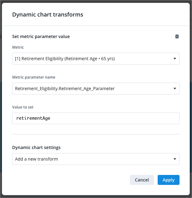
- Click Apply.
Now, when a user opens the analysis, they will be able to set the Retirement Age parameter value using the Parameters button, as shown next.
![]()
Example: Use chart transforms to set a custom value reference line
Let's say you have a Breakdown of Employee Ratio for Women by Organization Hierarchy in an analysis. In this visualization, you want your users to be able to see the target ratio as a reference line, but change it as required for their own organizations. You can use analysis parameters and chart transforms to enable this. For more information about reference lines, see Add a Reference Line.
First, add the reference line as a parameter:
- In the analysis, click the More options button . Hover over Make analysis dynamic and then click Edit dynamic analysis properties.
- In Parameters, click Add Parameter.
- In Parameter type, select Numeric.
- In Parameter variable name, type targetRatio.
- In Parameter display name, type Target Ratio.
- In Starting default value, type 0.4.
This means that the default reference line will be 40%. The user can change this when viewing the analysis.
- Click Save.
To add chart transforms to the visualization:
- Hover over the visualization and click the Make dynamic button .
- In the Dynamic chart transforms dialog, do the following:
- Click Add a new transform > Set custom value reference line.
- In Display Names, type "Target Ratio".
This is the name of the reference line that will be displayed in the visualization.
- In Custom Values, type "targetRatio".
This is the parameter variable name that you set earlier.
-
Click Apply.
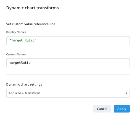
Now, when a user opens the analysis, they will be able to change the Target Ratio reference line value using the Parameters button. In the following screenshot, the user changed the Target Ratio reference line to 0.32, or 32%.
![]()
Population functions
Use the Visier Formula Language (VFL) to write statements for your dynamic template. Population functions are used in the dynamic template formulas (see Step Two: Make the analysis dynamic) and the dynamic chart transforms (see Step Three: Add dynamic visualizations) to create expressions and filters that make the analyses dynamic. These functions operate on populations.
Populations, such as focus population or related population, are written as variables that have a function expression. For example, you can use population functions to make the analysis's focus population equal to the trigger population plus the top 4 individuals who exited during the last 3 months in the scope population, written with the following formula:
focusPopulation := triggerPopulation + scopePopulation.findOverTime("hasExitinPeriod", "3M", 5).take(4)Tip: The following rules apply to the VFL when writing dynamic formulas:
- Use object names to pass parameters. For example, employeeCount is the object name of the Headcount metric.
- To assign values to a variable, use variable := value.
The following sections describe each population function, its syntax, and an example of the function's use.
anomalies
Takes in a population and returns the anomalies in that population over a time period. Anomalies are unexpected values. For example, a value could be in line with the average, however, if the same period in previous years was very low or high then the average value is unexpected and would be returned as an anomaly.
anomalies(
count: Int,
dimensions: [Dimension],
metric: Metric,
nTimePeriods: Int,
nContextualTimePeriods: Int,
scoreThreshold: Double,
varianceThreshold: Double,
supportThreshold: Int,
populationThreshold: Int,
accountForSeasonality: Boolean
) : [Population]- accountForSeasonality: If true, the function considers seasonal changes in the data when looking for anomalies.
- direction: The direction (above, below) to look for anomalies in the data.
- scoreThreshold: Indicates the algorithm's sensitivity as the number of standard deviations away from the norm to consider a value an anomaly. A higher number will find fewer anomalies.
- populationThreshold: Excludes segments of the population where the metric did not change by at least this amount. For example, if the threshold is 0.01 for Turnover Rate and the value does not change by more than 1% across the selected time context, then Visier will not look for any anomalies in that segment.
exitRateAnomalies := scopePopulation.anomalies(10, ["Gender"], accountForSeasonality = true, direction= "above", contextDimensions = ["Organization_Hierarchy"], metric = "Exit_Model.Rate.Exit", nTimePeriods = 12, nContextualTimePeriods = 36, scoreThreshold = 1.5, populationThreshold = 100)changeHistoryProperties
Returns the list of change history properties that are configured in AI Configuration in Studio. This is primarily used for debugging. For more information about population properties, see Configure AI Attributes.
{scopePopulation.changeHistoryProperties()}chooseDimension
Tip: Instead of using a population function, use the Change group by chart transform. Change group by has better contextual information about the visual. For more information, see Dynamic chart transforms.
Use heuristics to choose an interesting dimension to analyze this population. chooseDimension instructs the Visier platform to select a dimension it classifies as interesting to group the population by.
axisDim := yourPopulation.chooseDimension(yourPopulation.hierarchies())chooseDimensions
Tip: Instead of using a population function, use the Change group by chart transform. Change group by has better contextual information about the visual. For more information, see Dynamic chart transforms.
Use heuristics to sort the dimensions with the most interesting dimensions for analyzing this population appearing earliest in the list.
axisDims := yourPopulation.chooseDimensions(yourPopulation.hierarchies())In the above example's Change group by transform, you could then enter:
- Axis dimensions expression: axisDims
- Max number of charts to produce: 3
distinguishingProperties
Returns a set of significant attributes in the target population that differ from the properties associated with the bounding population. The bounding population is the population to use as context, such as the scope population. For example, if the scope population is a development team and all individuals in the population have the job name Developer, then Developer is not returned by distinguishingProperties.
distinguishingProperties(
scopePopulation: Population,
maxPropertiesReturned: Int,
overrideProperties,
sensitivityInput
): mail [String]- overrideProperties is optional. Default is all.
- sensitivityInput is optional. Default is 0, 5.
focusPopulation.distinguishingProperties(scopePopulation, 20)filter
Returns the population that satisfies the filter condition.
The filter concept must be the object name of the selection concept.
regrettablePopulation := focusPopulation.filter("isRegrettableExit")findOverTime
Returns a subset of population members based on the filter and time scope. The time scope expands backwards until at least minSize population items are found or the time limit is met.
findOverTime(
    filter: String,
    timeLimit: String,
    minSize: Int,
    dimensions: Seq[Dimension]
): Population- dimensions is optional, but recommended. If supplied, the population will be generalized over the given dimensions before expanding over time. For more information about generalization, see getGeneralizedFilters.
scopePopulation.findOverTime("hasExitInPeriod", "3M", 5, ["Job_Name"])population.findOverTime("hasRegrettableExitInPeriod", "1Y", 5, ["Job_Name"])population.findOverTime("hasVolunteering", "6M", 10, ["Age_Ranges"])getGeneralizedFilters
Returns a set of filters that bounds the population in the given dimensions. You can use getGeneralizedFilters in the filter function above or in various Dynamic chart transforms.
For hierarchical dimensions like leveled or parent-child, parent members can be selected to generalize a group of child members. For example, if many members of Sally's team are in the population, Sally may be used for the Organization Hierarchy dimension instead of the team members to generalize the population to Sally's team.
scopePopulation.getGeneralizedFilters("Organization_Hierarchy")getHierarchyMembers
Returns a new population that includes all members who match the specified attribute values. For example, [pop.getHierarchyMembers(["Age_Ranges"])] returns a new population defined by a filter for the age ranges that members of pop occupy. You can use this function anywhere you need to get a population.
agePopulation := triggerPopulation.getHierarchyMembers(["Age_Ranges"])getHierarchyMembersFilters
Returns a sequence of filters for each valid hierarchy member in the current population. The default is to retrieve all members at the deepest level of the hierarchy and create one filter per member. You can use this function anywhere you need to get filters from the existing population.
- depth is optional. If defined, depth retrieves hierarchy filters to the specified depth. If undefined, retrieves the deepest members of the hierarchy.
pop.getHierarchyMembersFilters("Location_Hierarchy")In the above example, the hierarchy includes the following levels:
- Level 1 (Countries): Canada, US
- Level 2 (Cities): Vancouver, Seattle
The formula returns two filters:
- Location_Hierarchy = Vancouver
- Location_Hierarchy = Seattle
pop.getHierarchyMembersFilters("Location_Hierarchy", depth = 1)The above formula returns two filters:
- Location_Hierarchy = Canada
- Location_Hierarchy = US
For more information about hierarchical dimensions, see Dimensions.
getSignificantFilters
A filter that separates this population from the bounding population. Returns a new population with this filter as its context filter. The bounding population is the population to use as context, such as the scope population. To retrieve significant filters, you must specify the population, such as the focus population or related population, and the maximum number of values to return.
getSignificantFilters(
scopePopulation: Population,
maxFilterCount: Int,
significantDims: Seq[String]
): Populations- significantDims is optional. Default is the existing configuration for significant dimensions.
focusPopulation.getSignificantFilters(scopePopulation, 2)getSummary
Returns a summary description of the population containing the names of the population members. If there are more than limit members, the summary is truncated. You can use getSummary to dynamically insert the names of the population members into your analysis, such as to describe the individuals that appear in a visualization.
If there are more than 10 members, the summary is truncated. You can increase the limit by specifying a number over 10 within the brackets, for example, triggerPopulation.getSummary(20).
hierarchies
Returns the symbol names of the dimensions that are configured in AI Configuration in Studio. This is primarily used in debugging. For more information about population dimensions, see Configure AI Attributes.
hierarchies: {triggerPopulation.hierarchies}map
Maps a population's subject members to a new population on a different subject by matching values on given dimensions. For example, this allows you to map from Candidate to Requisition by matching on RequisitionID. This returns a new population of members that satisfy the mapping criteria.
map(
subject: String,
dimensions: Seq[Dimension],
useFuzzyMatching: Boolean
): Population- useFuzzyMatching default is false.
triggerPopulation.map("Applicant", ["Job_Name"], false)applicants := employees.map("Applicant", ["Job_Name"], useFuzzyMatching = true)mapEventReference
This function maps events to populations, such as finding all the interview events for an applicant. The event must be based on the same subject as the population.
let minorityInterviewers = applicant.mapReference("Interview", "Interviewer", "Interview.Interviewer.isMinority")mapReference
This function maps insight populations to other populations, such as mapping employees to requisitions using a reference defined from the Employee subject to Requisition subject.
let manager = triggerPopulation.mapReference("Employee.Direct_Manager")In the above example, the formula returns a population containing the direct manager of the trigger population employee.
outlierGroups
Analyzes a population over the given dimensions and returns a list of filters. Each filter isolates a group with outlier values on the metric. If no specific metric is supplied, the metric is taken from the visualization context. If there is no visualization context, the default metric for the subject (configured in Studio) is used.
outlierGroups(
    maxGroupsReturned: Int,
    dimsToUse: Seq [String],
    direction: String,
    filterDims: Seq[Dim],
    includeZero: Boolean,
    lastCompletePeriod: Boolean,
    metricForOutliers: String
): Seq [Population]- direction is optional. Valid values are any, above, and below.
- filterDims is optional. To generate a list of filters from the population, provide a dimension.
- includeZero is optional. If true, returns data points that are zero. Default is true.
- lastCompletePeriod is optional. If true, returns data up to the last complete period. Default is true.
- metricForOutliers is optional. Default is the metric in the visualization.
scopePopulation.outlierGroups(3, ["Employee_Tenure_Year", "Job_Name"], "above", ["Organization_Hierarchy"])outliers
Returns a set of outliers within the population given the property inputs. Outliers typically finds extrema such as the largest or smallest value in a series.
The result may be empty if no outliers are found. If outliers are found, they are returned as a single population. For example, you can use outliers to find individuals within the focus population who are considered outliers from the norm for tenure.
focusPopulation.outliers(3, ["Employee_Tenure_Year"])properties
Returns the symbol names of the properties that are configured in AI Configuration in Studio. This is primarily used for debugging. For more information about population properties, see Configure AI Attributes.
relatedGroup
Returns a population within the scope population that is related to the current population. This is useful to find individuals who are similar to the current population within the scope. For example, if Rachel and Patrick are both nurses and the scope population is Andrew's team, relatedGroup will find other nurses within Andrew's team.
If you use properties to specify properties to use in the calculation, those properties are the most important properties to consider. If you configured Properties for an analytic object in the AI Configuration tab, the configured properties are appended to the list of properties to consider. For more information, see Configure AI Attributes.
Example:
Let's say that you configured Properties to include Job Name and Performance Rating. In one of your dynamic templates, you wrote the following insight formula:
focusPopulation.relatedGroup(scopePopulation, 2, "Employee.Tenure")The above formula finds members similar to the focus population with the highest weighting on Tenure. The formula then checks the other configured properties, Job Name and Performance Rating, to find members similar to the focus population.
relatedGroup(
boundingPopulation: Population,
properties: Seq [String],
addConfiguredProperties: Boolean
): Population- properties is optional. Default is the Properties configuration. For more information, see Configure AI Attributes.
- addConfiguredProperties is optional. If false, only the listed properties are used, and Properties are ignored. Default is true.
relatedPopulation := focusPopulation.relatedGroup(scopePopulation, 2).take(5)similarChangeProperties
Returns the list of properties with a similar change history within the bounding population. For example, you can use similarChangeProperties to rank properties based on which ones had the most similar changes with the focus population.
If you use properties to specify properties to use in the calculation, those properties are the most important properties to consider. If you configured Properties for an analytic object in the AI Configuration tab, the configured properties are appended to the list of properties to consider. For more information, see Configure AI Attributes.
Example:
Let's say that you configured Properties to include Job Name and Performance Rating. In one of your dynamic templates, you wrote the following insight formula:
focusPopulation.relatedGroup(scopePopulation, 2, "Employee.Tenure")The above formula finds members similar to the focus population with the highest weighting on Tenure. The formula then checks the other configured properties, Job Name and Performance Rating, to find members similar to the focus population.
similarChangeProperties (
scopePopulation: Population,
properties: Seq[String]
): Seq[Property]- properties is optional. Default is the Properties configuration. For more information, see Configure AI Attributes.
focusPopulation.similarChangeProperties(scopePopulation)similarProperties
Sorts the list of properties by similarity within the given population. The properties that are most uniform in the population sort to the beginning of the resulting list. For example, you can use similarProperties to return an ordered list based on which properties were the most similar within the focus population. This is useful for setting the order of properties in an individual comparison visualization.
If you use properties to specify properties to use in the calculation, those properties are the most important properties to consider. If you configured Properties for an analytic object in the AI Configuration tab, the configured properties are appended to the list of properties to consider. For more information, see Configure AI Attributes.
Example:
Let's say that you configured Properties to include Job Name and Performance Rating. In one of your dynamic templates, you wrote the following insight formula:
focusPopulation.relatedGroup(scopePopulation, 2, "Employee.Tenure")The above formula finds members similar to the focus population with the highest weighting on Tenure. The formula then checks the other configured properties, Job Name and Performance Rating, to find members similar to the focus population.
similarProperties (
properties: Seq[String]): Seq[String],
addConfiguredProperties: Boolean
); Seq[Property]- properties is optional. Default is the Properties configuration. For more information, see Configure AI Attributes.
- addConfiguredProperties is optional. If false, only the listed properties are used, and Properties are ignored. Default is true.
focusPopulation.similarProperties()size
Returns the number of members in the population. This includes active and inactive members.
sort
Returns a new population that contains the members of the given population sorted by the specified property. This is useful for large populations from which you want to find a smaller sample to analyze. This is similar to topN but the output only contains one population.
- descending is optional. Default is true.
focusPopulation.sort("EmployeeTenureYear").take(2)take
Returns a population that consists of, at most, the first N subjects.
mostSenior := scopePopulation.sort("EmployeeTenureYear", descending=true).take(4)timeRange
Returns a struct with information about the time range of the population. The members of the struct are start, end, timeUnit, and timeCount.
Using the above example, you can then write the following text in a text card: Population time range is from {theRange.start} to {theRange.end}.
topN
Sorts the members of a given population and then splits the members into two populations: a topN population and a remaining population. Returns a Seq containing [topN, remaining].
focusPopulation.topN(2, "Employee.Tenure", true)In the above example, the two populations are:
- The top two employees by tenure.
- The remaining members.
withName
Returns a named copy of this population. The population name is used to describe the population in various contexts.
scopePopulation.withName("My Team")withTime
Returns a copy of the population with adjusted time settings.
- length is optional. Specify as a number and letter, for example, "2y" for 2 years. Default is the current length.
- lastCompletePeriod is optional. If true, the reference time instant is the last complete period in the data. If false, the reference time instant is set to the data end date. If not specified, the reference time instant is left unchanged.
population2y := population.withTime(length = "2y", lastCompletePeriod = true)withTimeShift
Returns a copy of the population with a shifted time interval.
- shift is the amount of time specified as a number and letter that specifies the period, for example, "2y" for 2 years. Negative numbers shift towards the past.
shiftedPop = population.withTimeShift("-1y")Common expressions
subjectTimeInterval
Defines the time range.
subjectTimeInterval('Employee', periodType='M', excludeIncompletePeriod=true) .withLength('1M', anchor='End')
Transforms a time interval into a point in time.
subjectTimeInterval('Employee', periodType='M', excludeIncompletePeriod=true).withLength('1M', anchor='End') .shift()
Moves the time context forward or backward in time.
The following table defines the available time units to shift by.
|
Unit |
Code |
Example |
|---|---|---|
|
Year |
y |
.shift('-1y') |
|
Quarter |
q |
.shift('-1q') |
|
Month |
M |
.shift('-1M') |
|
Week |
w |
.shift('-1w') |
|
Day |
d |
.shift('-1d') |
subjectTimeInterval('Employee', periodType='M').shift('-1M')