
Build the Table Visual
Use the visual title and table settings to organize metric data into rows and columns.
Overview
You can use the visual title in combination with the Table settings panel to build your Table. To access the Table settings panel, click the Table settings button ![]() .
.
Use the following questions as guidance to determine your table's structure and what dimensions you want to add as rows and columns:
- Do you want to analyze a single metric or multiple metrics? This determines the number of metrics you'll add to the table.
- Do you want to look for trends over time? If so, you'll want to add time as a row or column.
- Do you want to compare a time range or discrete time periods? This determines whether or not you want to add custom time periods to the table.
- Do you want to drill down through your groups to reveal additional levels of detail? If so, you'll want to add groups as rows.
- Do you want to compare metric values across groups? If so, you'll want to add groups as columns for a side by side view.
Tip:
-
By default, zeros, null (N/A) values, and the Others data item are hidden.
-
To change the default settings, click your User icon
 > Preferences
  > Charts.
 -
When downloading data as a spreadsheet or consuming a Data Export, null (N/A) values in the visual will appear as blank (empty) cells in the destination.
Switching columns and rows
Switch rows and columns to view and work with your data in a different way.
Set column data
Choose the data you want to show in columns.
- In the Table settings panel, on the right side of Columns, click the Switch button
 and select an option from the list.
Switch data between rows and columns
You can quickly move metric or time data from rows to columns or vice versa.
Prerequisites: To perform this task, you must have added metrics or time as rows or columns.
- In the Table settings panel, click the Switch button in the Metric or Time box and select an option.
Working with metrics
Add metrics to create a summary report.
Add metrics
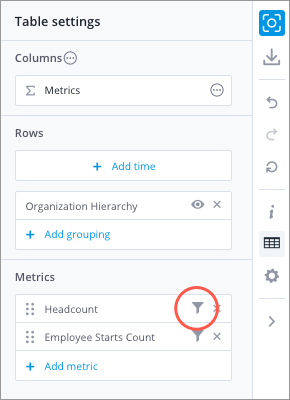
- In the Table settings panel, under Metrics, click Add metric.
- Refine the metric population
- Click the Edit metric button
 .
.
- In the Edit metric panel, click Add filter.
In the Filter picker, select the attribute values that define the population.
Note: Using the Filter picker in full screen
- Attribute values can be arranged into levels, so you may have to drill through multiple levels to find the value you want to include or exclude.
- Switch between the include and exclude option by clicking the Include/Exclude arrow.

- For more information, see Selecting the attribute values.
- Repeat Step 2b to add additional filters.
- When finished, click Done.
- Click the Edit metric button
Tip: You can also change the display name of the metric or select a new metric in the Edit metric panel.
Remove metrics
- In the Table settings panel, under Metrics, click the Remove button
 for the metric you want to remove.
Change metric display name
- In the Table settings panel, under Metrics, click the Edit metric button for the metric you want to rename.
- In the Display name field, type a display name, then click Done.
Reorder metrics
- In the Table settings panel, click the Move button
 for the metric you want to move and then drag it to the desired position. For more information about how data is displayed, see How Data is Organized in the Table Visual.
Working with time
Add a time range or custom time periods to look for trends over time.
You can have time appear as a time range or discrete (custom) time periods. By adding time as discrete time periods, each row or column can contain data for any time period or time range that you define.
Time in columns as a time range
| Q1 2016 | Q2 2016 | Q3 2016 | |
|---|---|---|---|
| Overall |
Time in columns as discrete time periods
| Q1 2016 | 2016-2018 | May 2011 | |
|---|---|---|---|
| Overall |
Prerequisites: To perform the following tasks, you must have added time to rows or columns.
Change the time range
- Click the Time picker on the Analysis Context toolbar or the Time box in the Table Settings panel to set the time granularity, window, and period.
Add discrete (custom) time periods
- In the Table settings panel, click the Switch button in the Time box, and then click Switch to custom periods.
- Click Add custom time period.
- In the Time picker, set the granularity and time period, then click Apply.
- Optional: Repeat steps 2 and 3 to add additional time periods.
Note:
- To customize the first time period in the list, click the Time picker on the Analysis Context toolbar.
- To switch to a time range, in the Table settings panel, click the Switch button in the Time box, and then click Switch to time range.
- You cannot reorder the custom time periods.
Remove discrete (custom) time periods
In the Table settings panel, click the Remove button ![]() for the time period you want to remove.
for the time period you want to remove.
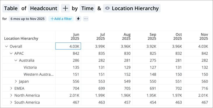
Working with groups
Group data together in rows or columns to make comparisons.
You can group data together in rows or columns to make your table easier to read and make comparisons. For example, you can group the Headcount metric by Organization to see the number of employees for each location.
Group as columns
| APAC | EMEA | North America | South America | |
|---|---|---|---|---|
| 2016 | ||||
| 2017 | ||||
| 2018 |
Group as rows
| 2016 | 2017 | 2018 | |
|---|---|---|---|
| APAC | |||
| EMEA | |||
| North America | |||
| South America |
You can also create a table with different levels of nested data by adding up to 4 groups as rows. A table with different levels provides greater flexibility and allows you to show just the data that you need. Simply collapse rows to show summary data and expand rows to explore detailed data for each group. For an example, see How hierarchical data is organized in a nested structure.
You can also create custom groups in columns. This will allow you to manually define the group for each column and add multidimensional groups (groups based on more than one attribute). For example, if you want to show data for managers who are women, you can create a custom group using the attributes Gender and Manager Status. By adding custom groups as columns, you can use the Table as a dashboard to monitor and report on your key metrics.
| Function: Finance | Manager; Gender: Woman | My Reports | |
|---|---|---|---|
| Headcount | |||
| Resignation Count | |||
| Hire Events |
Add group
Add single dimension groups (groups based on one attribute) as rows or columns.
- In the Table settings panel, do one of the following:
- To add a group as a row, under Rows, click Add grouping.
- To add a group as a column, on the right side of Columns, click the Switch button > Attribute.
-
In the Group dialog, select the attribute you want to base your group on.
- Optional: If the attribute has multiple levels, such as Location Hierarchy, select the levels you want to include. In this example, you can group data by Region, Country, State, or City level.
Note: You can add one group as columns and up to four groups as rows.
Add custom groups
Add manually defined groups as columns. Groups can be single or multidimensional groups (groups based on more than one attribute).
- Switch columns to Custom groups.
- In the Filter dialog, select the attribute values you want to include in your group, then click Apply.
- Optional: To add additional attribute values to define your group do the following:
- In the Table settings panel, click the group you want to edit.
- Click Add filter.
- In the Filter dialog, select the attribute values you want to include in your group, then click Apply.
- Repeat steps b and c to add additional filters.
- When finished adding filters, click Done.
- To add additional custom groups, in the Table settings panel under Columns, click Add column.
You can also apply or save your filters as key groups. For more information, see Create a Key Group.
Change custom groups display name
- In the Table settings panel, under Columns, click the Edit column button for the custom group you want to rename.
- In the Display name field, type a display name, then click Done.
Show or hide specific attribute values for a group
- In the Table settings panel, click the Add focus button
 for the group you want to show or hide values for.
 - In the Filter dialog, select the attribute values you want to show in the table and then click Apply.
Reorder groups
- In the Table settings panel, click the Move button for the group you want to move and drag it to the desired position. For more information about how data is displayed, see How Data is Organized in the Table Visual.
Remove groups
- In the Table settings panel, click the Remove button for the group you want to remove.
Working with calculations
Add calculations as columns.
Prerequisites: To perform the following task, you must have added two or more metrics, custom time periods, or custom groups as columns.
Add calculations
- In the Table settings panel, under Columns, click Add > Calculation.
- In the Add calculation panel, select a Calculation type.
- Select the columns to include in your calculation.
- Under Show comparison as, select Count or Percent.
- Click Done.
Note:
- Switching column types after adding a calculation column will result in the removal of all calculation columns from the table.
- Adding calculation columns for custom groups is not supported when creating a table for aggregated data exports.
Tip: You can also change the display name of the calculation or select a new calculation in the Add calculation panel.
Flatten the table structure
Expand hierarchical levels into columns for easier side-by-side comparison.
By default, the Table visual uses a nested structure that organizes data vertically. Indentation shows relationships between levels, allowing you to expand or collapse rows to see more detail. For more information, see How Data is Organized in the Table Visual.
While the nested structure is ideal for understanding hierarchy, it can be difficult to sort or compare values across different groups. To simplify your analysis, you can flatten the table by expanding hierarchical levels into individual columns, creating a spreadsheet-like layout.
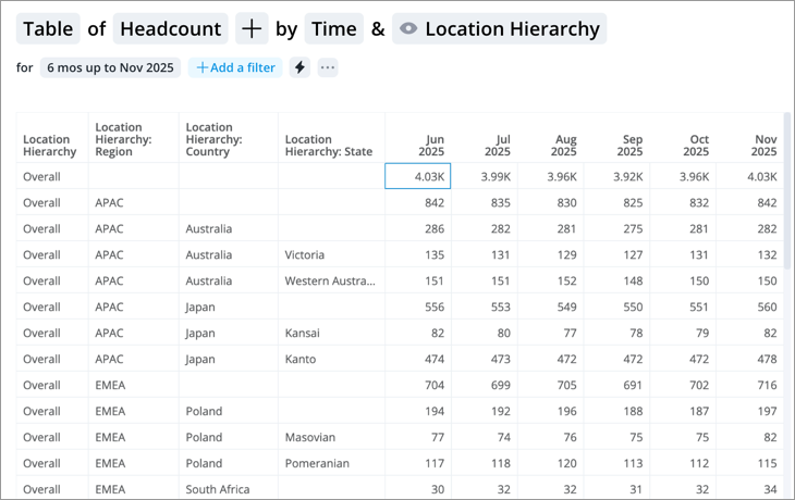
To flatten the table structure:
- Click the Settings button on the Visual Actions menu.
- In the Settings panel, under Table options, turn on the Expand all hierarchies into columns toggle.
- Optional: If you don't need the overall values, turn off the Show overall toggle to hide the column.
- Optional: If you want to see data at the lowest level of the hierarchy, turn on the Show lowest members only toggle.
Add traffic lighting rules
You can also highlight metric performance by applying traffic colors to the visual. For more information, see Traffic Lighting and Add Traffic Lighting Rules.
When adding metric traffic lighting to the Table visual, a custom time period can not be set when using the Change in metric value rule type. You can only use the Same period, previous year or Previous period presets.
For difference traffic lighting, you must add a calculation column to calculate the difference between two metrics.
Hide overall row
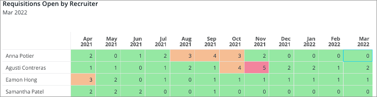
You can hide the overall row or column in a table. This is helpful in scenarios where the overall values are not meaningful, such as applying traffic lighting to additive metrics. For example, let's say you created a table that shows Requisitions Open by Recruiter. You apply the following traffic lighting rule: Metric value is greater than 5, traffic light as Bad. In this example, the entire overall row in the table will show as red because the metric is additive, as shown in the screenshot below.
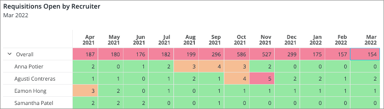
This is visually misleading because the traffic light rule applies only to each employee individually and should not include overall. In this case, we can hide the overall row for more accurate representation in the table, as shown in the screenshot below.
To hide the overall row or column:
-
Click the Settings button
on the Visual Actions menu. - In the Settings panel, under Table options, turn off the Show overall toggle.